Le Tutoriel de Flutter IndexedStack
1. IndexedStack
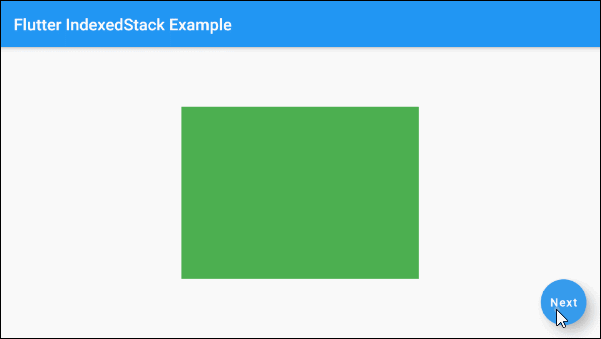
IndexedStack est une sous-classe de Stack. Contrairement à Stack, IndexedStack n'affiche au plus qu'un widget à la fois et masque les autres widgets. Il est possible de spécifier le widget enfant à afficher via la propriété index. Si index est null, aucun widget enfant ne sera affiché.
IndexedStack constructor
IndexedStack(
  {Key key,
  AlignmentGeometry alignment: AlignmentDirectional.topStart,
  TextDirection textDirection,
  StackFit sizing: StackFit.loose,
  int index: 0,
  List<Widget> children: const <Widget>[]}
)
En règle générale, la taille d'IndexedStack est aussi petite que possible et essaie d'être plus grande que tous ses enfants (sauf pour ceux Positioned ou Transform).
Il est possible de contrôler la taille de IndexedStack en le plaçant dans un SizedBox.
2. Examples
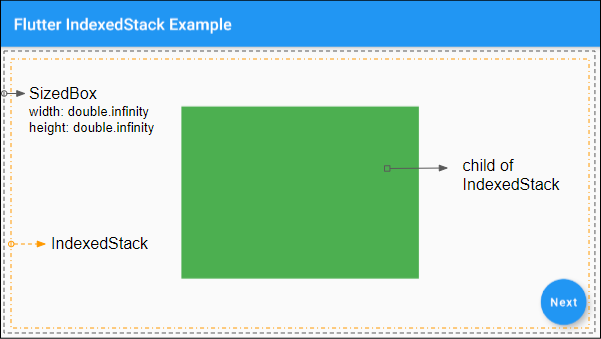
Un exemple simple à propos d'IndexedStack:
main.dart (ex1)
import 'package:flutter/material.dart';

void main() {
  runApp(MyApp());
}

class MyApp extends StatelessWidget {

  @override
  Widget build(BuildContext context) {
    return MaterialApp(
      title: 'o7planning.org',
      debugShowCheckedModeBanner: false,
      theme: ThemeData(
        primarySwatch: Colors.blue,
        visualDensity: VisualDensity.adaptivePlatformDensity,
      ),
      home: MyHomePage(),
    );
  }
}

class MyHomePage extends StatefulWidget {
  @override
  State<StatefulWidget> createState() {
    return _MyHomePageState();
  }
}

class _MyHomePageState extends State<MyHomePage> {

  int selectedIndex = 1;

  @override
  Widget build(BuildContext context) {
    return Scaffold(
      appBar: AppBar(
          title: Text("Flutter IndexedStack Example")
      ),
      body: SizedBox (
        width: double.infinity,
        height: double.infinity,
        child: IndexedStack (
            alignment: Alignment.center,
            index: this.selectedIndex,
            children: <Widget>[
              Container(
                width: 290,
                height: 210,
                color: Colors.green,
              ),
              Container(
                width: 250,
                height: 170,
                color: Colors.red,
              ),
              Container(
                width: 220,
                height: 150,
                color: Colors.yellow,
              ),
            ]
        ),
      ),
      floatingActionButton: FloatingActionButton(
        child: Text("Next"),
        onPressed: () {
          setState(() {
            if(this.selectedIndex < 2)  {
              this.selectedIndex++;
            } else {
              this.selectedIndex = 0;
            }
          });
        },
      ),
    );
  }
}
3. children
children - c'est une liste de widgets enfants d'IndexedStack.
List<Widget> children: const <Widget>[]}4. index
index: L'index du widget enfant sera affiché, sa valeur par défaut est 0. Si index est null, aucun widget enfant ne sera affiché.
int index: 05. fit (sizing)
Le paramètre de sizing dans le constructeur d'IndexedStack attribuera une valeur à la propriété fit. Il montre "Comment dimensionner les widgets enfants autres que Positioned of IndexedStack". La valeur par défaut de la propriété fit est StackFit.loose.
StackFit sizing: StackFit.loose

// Enum:
 StackFit.expand
 StackFit.loose
StackFit.passthrough- Le Tutoriel de Flutter StackFit
6. textDirection
La propriété textDirection est utilisée pour définir la direction du texte. Sa valeur affecte le comportement de la propriété alignment.
TextDirection textDirectionTutoriels de programmation Flutter
- Le Tutoriel de Flutter Column
- Le Tutoriel de Flutter Stack
- Le Tutoriel de Flutter IndexedStack
- Le Tutoriel de Flutter Spacer
- Le Tutoriel de Flutter Expanded
- Le Tutoriel de Flutter SizedBox
- Le Tutoriel de Flutter Tween
- Installer Flutter SDK sur Windows
- Installer Flutter Plugin pour Android Studio
- Créez votre première application Flutter - Hello Flutter
- Le Tutoriel de Flutter Scaffold
- Le Tutoriel de Flutter AppBar
- Le Tutoriel de Flutter BottomAppBar
- Le Tutoriel de Flutter TextButton
- Le Tutoriel de Flutter ElevatedButton
- Le Tutoriel de Flutter EdgeInsetsGeometry
- Le Tutoriel de Flutter EdgeInsets
- Le Tutoriel de CircularProgressIndicator
- Le Tutoriel de Flutter LinearProgressIndicator
- Le Tutoriel de Flutter Center
- Le Tutoriel de Flutter Align
- Le Tutoriel de Flutter Row
- Le Tutoriel de Flutter SplashScreen
- Le Tutoriel de Flutter Alignment
- Le Tutoriel de Flutter Positioned
- Le Tutoriel de Flutter SimpleDialog
- Le Tutoriel de Flutter AlertDialog
- Navigation et Routing dans Flutter
- Le Tutoriel de Flutter TabBar
- Le Tutoriel de Flutter Banner
- Le Tutoriel de Flutter BottomNavigationBar
- Le Tutoriel de Flutter FancyBottomNavigation
- Le Tutoriel de Flutter Card
- Le Tutoriel de Flutter Border
- Le Tutoriel de Flutter ContinuousRectangleBorder
- Le Tutoriel de Flutter RoundedRectangleBorder
- Le Tutoriel de Flutter CircleBorder
- Le Tutoriel de Flutter StadiumBorder
- Le Tutoriel de Flutter Container
- Le Tutoriel de Flutter RotatedBox
- Le Tutoriel de Flutter CircleAvatar
- Le Tutoriel de Flutter IconButton
- Le Tutoriel de Flutter FlatButton
- Le Tutoriel de Flutter SnackBar
Show More