Le Tutoriel de Flutter TabBar
1. Flutter Tab
TAB est une disposition d'interface largement utilisée dans différents cadres d'application, et Flutter ne fait pas l'exception. Flutter permet de créer une mise en page de TAB avec la bibliothèque de Material.
En principe, afin de créer une mise en page de TAB dans Flutter, il faut procéder à deux étapes suivantes:
- Créer un TabController.
- Créer un TabBar.
- Créer un TabBarView.
TabController
Pour que la mise en page de TAB fonctionne, il faut synchroniser le Tab sélectionné avec son contenu, cette tâche revient à TabController.
Il est possible de créer un TabController de manière manuelle, ou d'utliser un Widget disponible, celui de DefaultTabController, qui propose certaines fonctionnalités courantes.
TabController
DefaultTabController(
  // The number of tabs / content sections to display.
  length: 3,
  child: // Complete this code in the next step.
);
TabBar
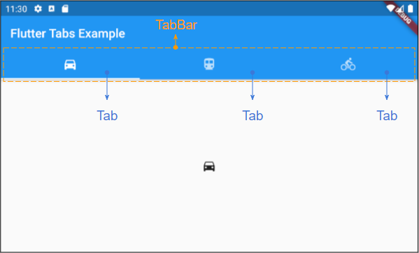
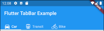
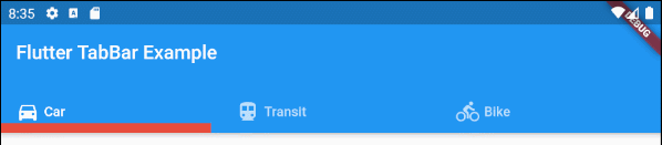
TabBar permet de créer les Tab(s), comme dans l'exemple ci-dessous, un TabBar contient trois sous-onglets.
TabBar
DefaultTabController(
  length: 3,
  child: Scaffold(
    appBar: AppBar(
      bottom: TabBar(
        tabs: [
          Tab(icon: Icon(Icons.directions_car)),
          Tab(icon: Icon(Icons.directions_transit)),
          Tab(icon: Icon(Icons.directions_bike)),
        ],
      ),
    ),
  ),
);
Remarque: Il est possible de placer plusieurs TabBar dans un DefaultTabController, mais le DefaultTabController fonctionne uniquement avec le TabBar le plus proche (Recherche par l'arborescence). Dans ce cas, il est nécessaire de créer votre propre TabController de manière manuelle.
TabBarView
Il est possible d'utiliser TabBarView pour contenir le contenu correspondant à chaque Tab dans le TabBar.
TabBarView
TabBarView (
children: [
Icon(Icons.directions_car),
Icon(Icons.directions_transit),
Icon(Icons.directions_bike),
],
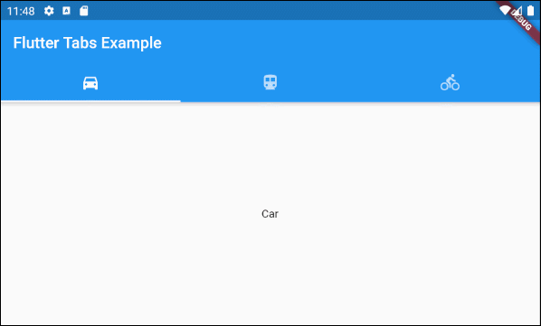
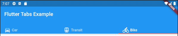
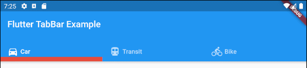
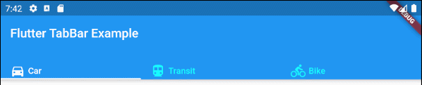
);2. TabBar example
main.dart (ex1)
import 'package:flutter/material.dart';

void main() {
  runApp(MyApp());
}

class MyApp extends StatelessWidget {
  // This widget is the root of your application.
  @override
  Widget build(BuildContext context) {
    return MaterialApp(
      title: 'Title of Application',
      theme: ThemeData(
        primarySwatch: Colors.blue,
        visualDensity: VisualDensity.adaptivePlatformDensity,
      ),
      home: MyHomePage(),
    );
  }
}

class MyHomePage extends StatelessWidget {
  MyHomePage({Key key}) : super(key: key);

  @override
  Widget build(BuildContext context) {
    return DefaultTabController(
        length: 3,
        child: Scaffold(
          appBar: AppBar(
            bottom: TabBar(
              tabs: [
                Tab(icon: Icon(Icons.directions_car)),
                Tab(icon: Icon(Icons.directions_transit)),
                Tab(icon: Icon(Icons.directions_bike)),
              ],
            ),
            title: Text('Flutter Tabs Example'),
          ),
          body: TabBarView(
            children: [
              Center(child: Text("Car")),
              Center(child: Text("Transit")),
              Center(child: Text("Bike"))
            ],
          ),
        )
    );
  }
}
3. TabController, TabBar ... Constructor
TabController Constructor
TabController Constructor
TabController(
    {int initialIndex: 0,
    @required int length,
    @required TickerProvider vsync}
)
DefaultTabController Constructor:
DefaultTabController Constructor
const DefaultTabController(
    {Key key,
    @required int length,
    int initialIndex: 0,
    @required Widget child}
)
TabBar Constructor:
TabBar Constructor
const TabBar(
    {Key key,
    @required List<Widget> tabs,
    TabController controller,
    bool isScrollable: false,
    Color indicatorColor,
    double indicatorWeight: 2.0,
    EdgeInsetsGeometry indicatorPadding: EdgeInsets.zero,
    Decoration indicator,
    TabBarIndicatorSize indicatorSize,
    Color labelColor,
    TextStyle labelStyle,
    EdgeInsetsGeometry labelPadding,
    Color unselectedLabelColor,
    TextStyle unselectedLabelStyle,
    DragStartBehavior dragStartBehavior: DragStartBehavior.start,
    MouseCursor mouseCursor,
    ValueChanged<int> onTap,
    ScrollPhysics physics}
)
TabBarView Constructor:
TabBarView Constructor
const TabBarView(
    {Key key,
    @required List<Widget> children,
    TabController controller,
    ScrollPhysics physics,
    DragStartBehavior dragStartBehavior: DragStartBehavior.start}
)
4. isScrollable
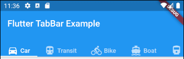
Si isScrollable est true, chaque Tab ajuste son contenu en largeur et le TabBar dispose d'une barre de défilement horizontale.
main.dart (isScrollable ex1)
import 'package:flutter/material.dart';
void main() {
runApp(MyApp());
}
class MyApp extends StatelessWidget {
// This widget is the root of your application.
@override
Widget build(BuildContext context) {
return MaterialApp(
title: 'Title of Application',
theme: ThemeData(
primarySwatch: Colors.blue,
visualDensity: VisualDensity.adaptivePlatformDensity,
),
home: MyHomePage(),
);
}
}
class MyHomePage extends StatelessWidget {
MyHomePage({Key key}) : super(key: key);
@override
Widget build(BuildContext context) {
EdgeInsets a2; EdgeInsetsDirectional a;
return DefaultTabController(
length: 6,
child: Scaffold(
appBar: AppBar(
bottom: createTabBar(),
title: Text('Flutter TabBar Example'),
),
body: TabBarView(
children: [
Center(child: Text("Car")),
Center(child: Text("Transit")),
Center(child: Text("Bike")),
Center(child: Text("Boat")),
Center(child: Text("Railway")),
Center(child: Text("Bus"))
],
),
)
);
}
TabBar createTabBar() {
return TabBar(
tabs: [
Row (children: [Icon(Icons.directions_car), SizedBox(width:5), Text("Car")]),
Row (children: [Icon(Icons.directions_transit), SizedBox(width:5), Text("Transit")]),
Row (children: [Icon(Icons.directions_bike), SizedBox(width:5), Text("Bike")]),
Row (children: [Icon(Icons.directions_boat), SizedBox(width:5), Text("Boat")]),
Row (children: [Icon(Icons.directions_railway), SizedBox(width:5), Text("Railway")]),
Row (children: [Icon(Icons.directions_bus), SizedBox(width:5), Text("Bus")]),
],
isScrollable: true,
);
}
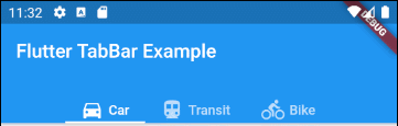
}Par exemple, aligner les Tabs à gauche dans le cas de TabBar.isScrollable = true.
main.dart (isScrollable ex2)
import 'package:flutter/material.dart';
void main() {
runApp(MyApp());
}
class MyApp extends StatelessWidget {
// This widget is the root of your application.
@override
Widget build(BuildContext context) {
return MaterialApp(
title: 'Title of Application',
theme: ThemeData(
primarySwatch: Colors.blue,
visualDensity: VisualDensity.adaptivePlatformDensity,
),
home: MyHomePage(),
);
}
}
class MyHomePage extends StatelessWidget {
MyHomePage({Key key}) : super(key: key);
@override
Widget build(BuildContext context) {
EdgeInsets a2; EdgeInsetsDirectional a;
return DefaultTabController(
length: 3,
child: Scaffold(
appBar: AppBar(
bottom: PreferredSize(
preferredSize: Size.fromHeight(40),
child: Align(
alignment: Alignment.centerLeft,
child: TabBar(
isScrollable: true,
tabs: [ Row (children: [Icon(Icons.directions_car), SizedBox(width:5), Text("Car")]),
Row (children: [Icon(Icons.directions_transit), SizedBox(width:5), Text("Transit")]),
Row (children: [Icon(Icons.directions_bike), SizedBox(width:5), Text("Bike")])],
),
),
),
title: Text('Flutter TabBar Example'),
),
body: TabBarView(
children: [
Center(child: Text("Car")),
Center(child: Text("Transit")),
Center(child: Text("Bike"))
],
),
)
);
}
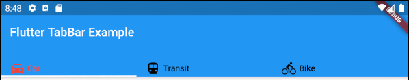
}5. indicatorColor
La propriété indicatorColor permet de spécifier la couleur de la ligne sous le Tab sélectionné. Cette propriété est ignorée si la propriété indicator est spécifiée.
Color indicatorColorPar exemple: Définir la couleur rouge pour la ligne sous le Tab sélectionné:
indicatorColor (ex1)
TabBar (
  tabs: [
    Row (children: [Icon(Icons.directions_car), SizedBox(width:5), Text("Car")]),
    Row (children: [Icon(Icons.directions_transit), SizedBox(width:5), Text("Transit")]),
    Row (children: [Icon(Icons.directions_bike), SizedBox(width:5), Text("Bike")]),
  ],
  indicatorColor: Color(0xffE74C3C),
);- Le Tutoriel de Flutter Color
6. indicatorWeight
La propriété indicatorWeight est utilisée pour définir l'épaisseur (thickness) de la ligne (line) sous le Tab actuellement sélectionné. Sa valeur est supérieure de 0, et la valeur par défaut est 2. Cette propriété est ignorée si la propriété indicator est spécifiée.
double indicatorWeight;Par exemple: définir l'épaisseur (thickness) pour la ligne sous le Tab actuellement sélectionné.
indicatorWeight (ex1)
TabBar(
  tabs: [
    Row (children: [Icon(Icons.directions_car), SizedBox(width:5), Text("Car")]),
    Row (children: [Icon(Icons.directions_transit), SizedBox(width:5), Text("Transit")]),
    Row (children: [Icon(Icons.directions_bike), SizedBox(width:5), Text("Bike")]),
  ],
  indicatorColor: Color(0xffE74C3C),
  indicatorWeight: 10
);
7. indicatorPadding
La propriété indicatorPadding spécifie le padding à l'horizontale pour la ligne sous le Tab actuellement sélectionné.
EdgeInsetsGeometry indicatorPadding
Par exemple:
indicatorPadding (ex1)
TabBar(
  tabs: [
    Row (children: [Icon(Icons.directions_car), SizedBox(width:5), Text("Car")]),
    Row (children: [Icon(Icons.directions_transit), SizedBox(width:5), Text("Transit")]),
    Row (children: [Icon(Icons.directions_bike), SizedBox(width:5), Text("Bike")]),
  ],
  indicatorColor: Color(0xffE74C3C),
  indicatorWeight: 10,
  indicatorPadding: EdgeInsets.only(right: 20),
);
8. indicator
La propriété indicator permet de définir l'apparence du Tab actuellement sélectionné. Si cette propriété est utilisée, les autres propriétés comme indicatorColor, indicatorWeight et indicatorPadding sont ignorées.
Decoration indicator;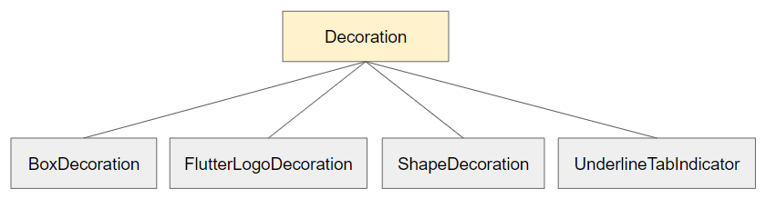
Par exemple:
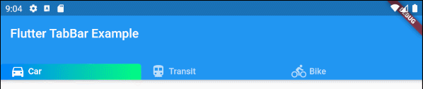
indicator (ex1)
TabBar(
  tabs: [
    Row (children: [Icon(Icons.directions_car), SizedBox(width:5), Text("Car")]),
    Row (children: [Icon(Icons.directions_transit), SizedBox(width:5), Text("Transit")]),
    Row (children: [Icon(Icons.directions_bike), SizedBox(width:5), Text("Bike")]),
  ],
  indicator: ShapeDecoration (
      shape: UnderlineInputBorder (
          borderSide: BorderSide(
              color: Colors.transparent,
              width: 0,
              style: BorderStyle.solid
          )
      ),
      gradient: LinearGradient(colors: [Color(0xff0081ff), Color(0xff01ff80)])
  )
);- Le Tutoriel de Flutter Decoration
9. labelColor
La propriété labelColor est utilisée pour définir la couleur pour l'étiquette (label) du Tab actuellement sélectionné.
Color labelColor;Par exemple:
TabBar(
    tabs: [
      Row (children: [Icon(Icons.directions_car), SizedBox(width:5), Text("Car")]),
      Row (children: [Icon(Icons.directions_transit), SizedBox(width:5), Text("Transit")]),
      Row (children: [Icon(Icons.directions_bike), SizedBox(width:5), Text("Bike")]),
    ],
    labelColor: Colors.red,
    unselectedLabelColor: Colors.black,
);
10. unselectedLabelColor
La propriété unselectedLabelColor est utilisée pour définir la couleur de l'étiquette (label) des Tabs non sélectionnés.
Color unselectedLabelColor;Par exemple:
unselectedLabelColor (ex1)
TabBar(
  tabs: [
    Row (children: [Icon(Icons.directions_car), SizedBox(width:5), Text("Car")]),
    Row (children: [Icon(Icons.directions_transit), SizedBox(width:5), Text("Transit")]),
    Row (children: [Icon(Icons.directions_bike), SizedBox(width:5), Text("Bike")]),
  ],
  labelColor: Colors.white,
  unselectedLabelColor: Colors.cyanAccent,
);
11. labelPadding
La propriété labelPadding est utilisée pour ajouter padding à chaque étiquette (label) des Tabs.
EdgeInsetsGeometry labelPadding;Par exemple:
labelPadding (ex1)
TabBar(
  tabs: [
    Row (children: [Icon(Icons.directions_car), SizedBox(width:5), Text("Car")]),
    Row (children: [Icon(Icons.directions_transit), SizedBox(width:5), Text("Transit")]),
    Row (children: [Icon(Icons.directions_bike), SizedBox(width:5), Text("Bike")]),
  ],
  labelPadding: EdgeInsets.all( 20),
);
12. labelStyle
La propriété labelStyle est utilisée pour définir le style du texte affiché sur l'étiquette des Tabs actuellement sélectionnés.
TextStyle labelStyle;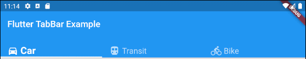
labelStyle (ex1)
TabBar(
  tabs: [
    Row (children: [Icon(Icons.directions_car), SizedBox(width:5), Text("Car")]),
    Row (children: [Icon(Icons.directions_transit), SizedBox(width:5), Text("Transit")]),
    Row (children: [Icon(Icons.directions_bike), SizedBox(width:5), Text("Bike")]),
  ],
  labelStyle: TextStyle(fontWeight: FontWeight.bold, fontSize: 22),
  unselectedLabelStyle: TextStyle(fontStyle: FontStyle.normal, fontSize: 18),
);- Le Tutoriel de Flutter TextStyle
13. unselectedLabelStyle
La propriété unselectedLabelStyle est utilisée pour définir le style du texte affiché sur l'étiquette des Tab(s) non sélectionnés.
TextStyle unselectedLabelStyle;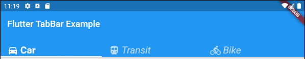
unselectedLabelStyle (ex1)
TabBar(
  tabs: [
    Row (children: [Icon(Icons.directions_car), SizedBox(width:5), Text("Car")]),
    Row (children: [Icon(Icons.directions_transit), SizedBox(width:5), Text("Transit")]),
    Row (children: [Icon(Icons.directions_bike), SizedBox(width:5), Text("Bike")]),
  ],
  labelStyle: TextStyle(fontWeight: FontWeight.bold, fontSize: 22),
  unselectedLabelStyle: TextStyle(fontStyle: FontStyle.italic),
);- Le Tutoriel de Flutter TextStyle
14. onTap
onTap est une fonction de callback appelée lorsque l'utilisateur touche (tap) à un Tab du TabBar.
ValueChanged<int> onTap;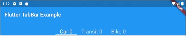
main.dart (onTap ex1)
import 'package:flutter/material.dart';

void main() {
  runApp(MyApp());
}

class MyApp extends StatelessWidget {
  // This widget is the root of your application.
  @override
  Widget build(BuildContext context) {
    return MaterialApp(
      title: 'Title of Application',
      theme: ThemeData(
        primarySwatch: Colors.blue,
        visualDensity: VisualDensity.adaptivePlatformDensity,
      ),
      home: MyHomePage(),
    );
  }
}

class MyHomePage extends StatefulWidget {
  MyHomePage({Key key}) : super(key: key);

  @override
  State<StatefulWidget> createState() {
    return MyHomePageState();
  }
}

class MyHomePageState extends State<MyHomePage> {
  int carClick = 0;
  int transitClick = 0;
  int bikeClick = 0;

  @override
  Widget build(BuildContext context) {
    return DefaultTabController(
        length: 3,
        child: Scaffold(
          appBar: AppBar(
            bottom: createTabBar(),
            title: Text('Flutter TabBar Example'),
          ),
          body: TabBarView(
            children: [
              Center(child: Text("Car")),
              Center(child: Text("Transit")),
              Center(child: Text("Bike"))
            ],
          ),
        )
    );
  }

  TabBar createTabBar()  {
    return TabBar(
        isScrollable: true,
        labelStyle: TextStyle(fontSize: 20),
        tabs: [
          Text("Car " + this.carClick.toString()),
          Text("Transit " + this.transitClick.toString()),
          Text("Bike " + this.bikeClick.toString())
        ],
        onTap: (index) {
          this.onTapHandler(index);
        }
    );
  }

  void onTapHandler(int index)  {
    setState(()  {
      switch(index){
        case 0:
          carClick++;
          break;
        case 1:
          transitClick++;
          break;
        case 2:
          bikeClick++;
          break;
      }
    });
  }

}Tutoriels de programmation Flutter
- Le Tutoriel de Flutter Column
- Le Tutoriel de Flutter Stack
- Le Tutoriel de Flutter IndexedStack
- Le Tutoriel de Flutter Spacer
- Le Tutoriel de Flutter Expanded
- Le Tutoriel de Flutter SizedBox
- Le Tutoriel de Flutter Tween
- Installer Flutter SDK sur Windows
- Installer Flutter Plugin pour Android Studio
- Créez votre première application Flutter - Hello Flutter
- Le Tutoriel de Flutter Scaffold
- Le Tutoriel de Flutter AppBar
- Le Tutoriel de Flutter BottomAppBar
- Le Tutoriel de Flutter TextButton
- Le Tutoriel de Flutter ElevatedButton
- Le Tutoriel de Flutter EdgeInsetsGeometry
- Le Tutoriel de Flutter EdgeInsets
- Le Tutoriel de CircularProgressIndicator
- Le Tutoriel de Flutter LinearProgressIndicator
- Le Tutoriel de Flutter Center
- Le Tutoriel de Flutter Align
- Le Tutoriel de Flutter Row
- Le Tutoriel de Flutter SplashScreen
- Le Tutoriel de Flutter Alignment
- Le Tutoriel de Flutter Positioned
- Le Tutoriel de Flutter SimpleDialog
- Le Tutoriel de Flutter AlertDialog
- Navigation et Routing dans Flutter
- Le Tutoriel de Flutter TabBar
- Le Tutoriel de Flutter Banner
- Le Tutoriel de Flutter BottomNavigationBar
- Le Tutoriel de Flutter FancyBottomNavigation
- Le Tutoriel de Flutter Card
- Le Tutoriel de Flutter Border
- Le Tutoriel de Flutter ContinuousRectangleBorder
- Le Tutoriel de Flutter RoundedRectangleBorder
- Le Tutoriel de Flutter CircleBorder
- Le Tutoriel de Flutter StadiumBorder
- Le Tutoriel de Flutter Container
- Le Tutoriel de Flutter RotatedBox
- Le Tutoriel de Flutter CircleAvatar
- Le Tutoriel de Flutter IconButton
- Le Tutoriel de Flutter FlatButton
- Le Tutoriel de Flutter SnackBar
Show More