Le Tutoriel de Flutter AppBar
1. AppBar
Dans Flutter, AppBar (La barre d'applications) comprend une barre d'outil (Tool Bar) et autres Widget potentiels. Précisément, AppBar est divisée en cinq zones: leading, title, Tool Bar (actions), flexiableSpace, bottom.

AppBar Constructor:
AppBar Constructor
AppBar( {Key key,
    Widget leading,
    bool automaticallyImplyLeading: true,
    Widget title,
    List<Widget> actions,
    Widget flexibleSpace,
    PreferredSizeWidget bottom,
    double elevation,
    Color shadowColor,
    ShapeBorder shape,
    Color backgroundColor,
    Brightness brightness,
    IconThemeData iconTheme,
    IconThemeData actionsIconTheme,
    TextTheme textTheme,
    bool primary: true,
    bool centerTitle,
    bool excludeHeaderSemantics: false,
    double titleSpacing: NavigationToolbar.kMiddleSpacing,
    double toolbarOpacity: 1.0,
    double bottomOpacity: 1.0,
    double toolbarHeight
  }
)
Normallement, AppBar est placée dans un Scaffold (Cadre) via la propriété Scaffold.appBar. AppBar dispose d'une hauteur fixe et apparaît en haut de Scaffbar. Si vous souhatez obtenir une barre d'applications défilante, utilisez SliverAppBar.
- SliverAppBar
- Scaffold
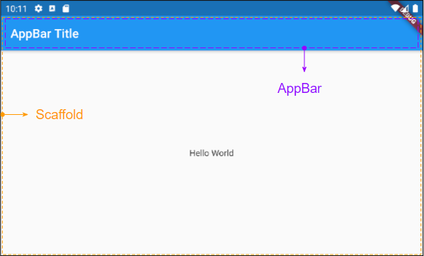
2. title
Widget title;Par exemple, une AppBar simple se compose d'un titre placé dans un Scaffold. Elle apparaît en haut de Scaffold.
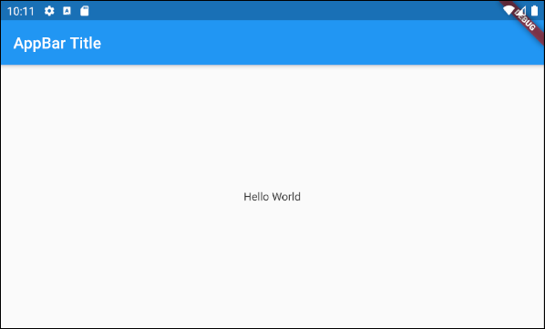
main.dart (title ex1)
import 'package:flutter/material.dart';
void main() {
runApp(MyApp());
}
class MyApp extends StatelessWidget {
// This widget is the root of your application.
@override
Widget build(BuildContext context) {
return MaterialApp(
title: 'Title of Application',
theme: ThemeData(
primarySwatch: Colors.blue,
visualDensity: VisualDensity.adaptivePlatformDensity,
),
home: MyHomePage(),
);
}
}
class MyHomePage extends StatelessWidget {
MyHomePage({Key key}) : super(key: key);
@override
Widget build(BuildContext context) {
return Scaffold(
appBar: AppBar(
title: Text("AppBar Title"),
),
body: Center(
child: Text(
'Hello World',
)
),
);
}
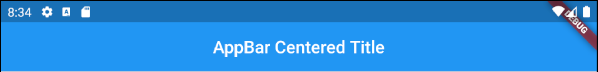
}Un exemple d'une AppBar avec un titre centré ou aligné à droite:
AppBar(
title: Align (
child: Text("AppBar Centered Title"),
alignment: Alignment.center
)
);
AppBar(
title: Align (
child: Text("AppBar Right Title"),
alignment: Alignment.centerRight
)
);
AppBar(
title: Text("AppBar Centered Title"),
centerTitle: true,
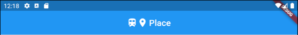
);Un exemple de création d'un "Title Widget" composé d'îcones (icon) et de texte.
main.dart (title ex3)
import 'package:flutter/material.dart';

void main() {
  runApp(MyApp());
}

class MyApp extends StatelessWidget {

  @override
  Widget build(BuildContext context) {
    return MaterialApp(
      title: 'Title of Application',
      theme: ThemeData(
        primarySwatch: Colors.blue,
        visualDensity: VisualDensity.adaptivePlatformDensity,
      ),
      home: MyHomePage(),
    );
  }
}

class MyHomePage extends StatelessWidget {
  MyHomePage({Key key}) : super(key: key);

  @override
  Widget build(BuildContext context) {
    return Scaffold(
      appBar: AppBar(
          title: IconTitleWidget()
      ),
      body: Center(
          child: Text(
            'Flutter AppBar Tutorial',
          )
      ),
    );
  }
}

class IconTitleWidget extends StatelessWidget {

  @override
  Widget build(BuildContext context) {
    imageCache.clear();
    return Row (
      mainAxisAlignment: MainAxisAlignment.center, // Centers horizontally
      crossAxisAlignment: CrossAxisAlignment.center, // Centers vertically
      children: <Widget>[
        Icon(Icons.train),
        Icon(Icons.place),
        // The SizedBox provides an immediate spacing between the widgets
        SizedBox (
          width: 3,
        ),
        Text(
          "Place",
        )
      ],
    );
  }
}
3. leading
leading est un Widget placé devant la zone title. En général, il s'agit d'une îcone ou d'un IconButton.
Widget leading;Par exemple: leading est un IconButton. Lorsque l'utilisateur clique sur IconButton, une certaine action est exécutée.
// Example: leading is an IconButton
appBar: AppBar(
    title: Text("AppBar Title"),
    leading: IconButton(
        icon: Icon(Icons.notifications_active),
        onPressed: () {
             // Do something.
        }
    )
)

// Example: leading is an Icon
appBar: AppBar(
    title: Text("AppBar Title"),
    leading: Icon(Icons.notifications_active)
)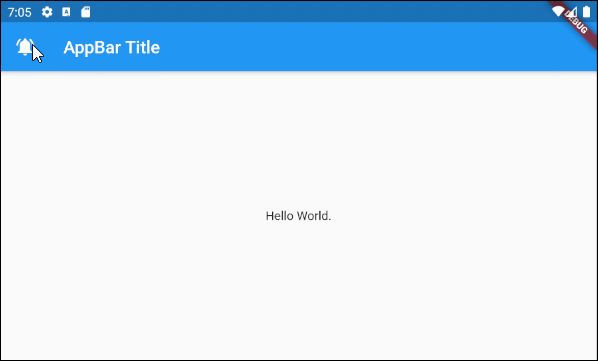
main.dart (leading ex1)
import 'package:flutter/material.dart';

void main() {
  runApp(MyApp());
}

class MyApp extends StatelessWidget {
  // This widget is the root of your application.
  @override
  Widget build(BuildContext context) {
    return MaterialApp(
      title: 'Title of Application',
      theme: ThemeData(
        primarySwatch: Colors.blue,
        visualDensity: VisualDensity.adaptivePlatformDensity,
      ),
      home: MyHomePage(),
    );
  }
}

class MyHomePage extends StatelessWidget {
  MyHomePage({Key key}) : super(key: key);

  @override
  Widget build(BuildContext context) {
    return Scaffold(
      appBar: AppBar(
          title: Text("AppBar Title"),
          leading: IconButton(
              icon: Icon(Icons.notifications_active),
              onPressed: () {
                showAlert(context);
              }
          )
      ),
      body: Center(
          child:  Text("Hello World.")
      ),
    );
  }

  void showAlert(BuildContext context) {
    showDialog(
        context: context,
        builder: (context) => AlertDialog(
          content: Text("Hi"),
        ));
  }
}
Par exemple:

main.dart (leading ex2)
import 'package:flutter/material.dart';

void main() {
  runApp(MyApp());
}

class MyApp extends StatelessWidget {
  // This widget is the root of your application.
  @override
  Widget build(BuildContext context) {
    return MaterialApp(
      title: 'Title of Application',
      theme: ThemeData(
        primarySwatch: Colors.blue,
        visualDensity: VisualDensity.adaptivePlatformDensity,
      ),
      home: MyHomePage(),
    );
  }
}

class MyHomePage extends StatelessWidget {
  MyHomePage({Key key}) : super(key: key);

  @override
  Widget build(BuildContext context) {
    return Scaffold(
      appBar: AppBar(
          title: Text("AppBar Title"),
          leading: MyVolumeButton()
      ),
      body: Center(
          child:  Text("Hello World.")
      ),
    );
  }

}

class MyVolumeButton extends StatefulWidget {
  MyVolumeButton({Key key}) : super(key: key);

  @override
  State<StatefulWidget> createState() {
    return MyVolumeButtonState();
  }
}

class MyVolumeButtonState extends State<MyVolumeButton> {
  bool volumeOn = true;

  @override
  Widget build(BuildContext context) {
    return IconButton(
        icon: this.volumeOn? Icon(Icons.volume_up):Icon(Icons.volume_mute),
        onPressed: () {
          // Set new State
          setState(() => this.volumeOn = !this.volumeOn);
        }
    );
  }
}
4. automaticallyImplyLeading
bool automaticallyImplyLeading: true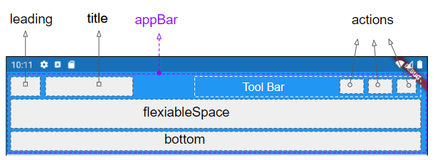
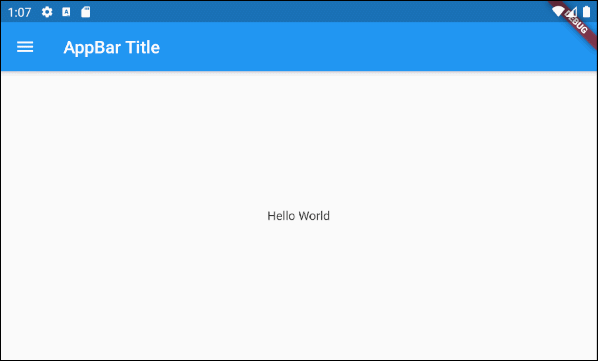
automaticallyImplyLeading est une propriété facultative de l'AppBar, dont la valeur par défault est true. Si vous ne placez aucun Widget dans la zone leading, donc, un Widget approprié sera probablement placé de manière automatique en fonction du contexte.
Cas 1: Un IconButton est automatiquement ajouté à la zone leading de l'AppBar pour permettre d'ouvrir un Drawer (Tiroir) si les conditions suivantes sont réunies:
- La zone leading de l'AppBar est vide.
- AppBar.automaticallyImplyLeading : true.
- AppBar est placé dans un Scaffold.
- Scaffold contient un Drawer (Scaffold.drawer est spécifié).
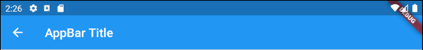
Cas 2: Un IconButton - "BACK" sera automatiquement ajouté à la zone leading d'une AppBar pour permettre de revenir à l'écran précédent si les conditions suivantes sont réunies:
- La zone leading de l'AppBar est vide.
- AppBar.automaticallyImplyLeading : true.
- AppBar.drawer : null
- Vous accédez à l'écran (screen) actuel à partir d'un écran précédent.
main.dart (automaticallyImplyLeading : true)
import 'package:flutter/material.dart';

void main() {
  runApp(MyApp());
}

class MyApp extends StatelessWidget {
  // This widget is the root of your application.
  @override
  Widget build(BuildContext context) {
    return MaterialApp(
      title: 'Title of Application',
      theme: ThemeData(
        primarySwatch: Colors.blue,
        visualDensity: VisualDensity.adaptivePlatformDensity,
      ),
      home: MyHomePage(),
    );
  }
}

class MyHomePage extends StatelessWidget {
  MyHomePage({Key key}) : super(key: key);

  @override
  Widget build(BuildContext context) {
    return Scaffold(
      // AppBar with automaticallyImplyLeading = "true" (Default)
      appBar: AppBar(
          title: Text("AppBar Title"),
          automaticallyImplyLeading: true
      ),
      body: Center(
          child:  Text("Hello World.")
      ),
      drawer: Drawer(
        child: ListView(
          children: const <Widget> [
            DrawerHeader(
              decoration: BoxDecoration(
                color: Colors.green,
              ),
              child: Text(
                'My Drawer',
                style: TextStyle(
                  color: Colors.green,
                  fontSize: 24,
                ),
              ),
            ),
            ListTile(
              title: Text('Gallery'),
            ),
            ListTile(
              title: Text('Slideshow'),
            ),
          ],
        ),
      ),
    );
  }
}
5. actions
La propriété actions permet d'ajouter des actions à la barre d'outils (Tool bar) de l'AppBar. En général, IconButton est utilisé pour chaque action usuelle. Cependant, pour les actions moins usuelles, vous pouvez utiliser PopupMenuButton.
List<Widget> actions
Un exemple sur l'ajout d'action(s) à la barre d'outils de l'AppBar.
main.dart (actions ex1)
import 'package:flutter/material.dart';
void main() {
runApp(MyApp());
}
class MyApp extends StatelessWidget {
@override
Widget build(BuildContext context) {
return MaterialApp(
title: 'Title of Application',
theme: ThemeData(
primarySwatch: Colors.blue,
visualDensity: VisualDensity.adaptivePlatformDensity,
),
home: MyHomePage(),
);
}
}
class MyHomePage extends StatelessWidget {
MyHomePage({Key key}) : super(key: key);
@override
Widget build(BuildContext context) {
return Scaffold(
appBar: AppBar(
title: Text("AppBar Title"),
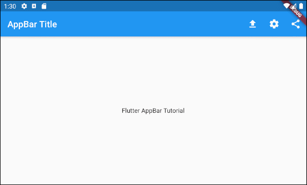
actions: <Widget> [
IconButton(
icon: Icon(Icons.file_upload),
onPressed: () => {
print("Click on upload button")
},
),
IconButton(
icon: Icon(Icons.settings),
onPressed: () => {
print("Click on settings button")
}
),
PopupMenuButton(
icon: Icon(Icons.share),
itemBuilder: (context) => [
PopupMenuItem(
value: 1,
child: Text("Facebook"),
),
PopupMenuItem(
value: 2,
child: Text("Instagram"),
),
],
)
]
),
body: Center(
child: Text(
'Flutter AppBar Tutorial',
)
),
);
}
}Remarque: La hauteur des actions est limitée par celle de la barre d'outils (Tool Bar), mais vous pouvez définir la hauteur de la barre d'outils à l'aide de la propriété toolbarHeight.
- Le Tutoriel de Flutter IconButton
- Le Tutoriel de Flutter PopupMenuButton
6. bottom
La zone bottom de l'AppBar est souvent utilisée pour contenir une TabBar.
PreferredSizeWidget bottom;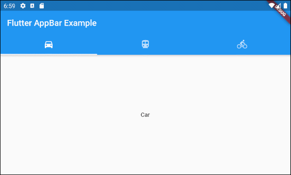
main.dart (bottom ex1)
import 'package:flutter/material.dart';

void main() {
  runApp(MyApp());
}

class MyApp extends StatelessWidget {
  // This widget is the root of your application.
  @override
  Widget build(BuildContext context) {
    return MaterialApp(
      title: 'Title of Application',
      theme: ThemeData(
        primarySwatch: Colors.blue,
        visualDensity: VisualDensity.adaptivePlatformDensity,
      ),
      home: MyHomePage(),
    );
  }
}

class MyHomePage extends StatelessWidget {
  MyHomePage({Key key}) : super(key: key);

  @override
  Widget build(BuildContext context) {
    return DefaultTabController(
        length: 3,
        child: Scaffold(
          appBar: AppBar(
            bottom: TabBar(
              tabs: [
                Tab(icon: Icon(Icons.directions_car)),
                Tab(icon: Icon(Icons.directions_transit)),
                Tab(icon: Icon(Icons.directions_bike)),
              ],
            ),
            title: Text('Flutter AppBar Example'),
          ),
          body: TabBarView (
            children: [
              Center(child: Text("Car")),
              Center(child: Text("Transit")),
              Center(child: Text("Bike"))
            ],
          ),
        )
    );
  }
}Tutoriels de programmation Flutter
- Le Tutoriel de Flutter Column
- Le Tutoriel de Flutter Stack
- Le Tutoriel de Flutter IndexedStack
- Le Tutoriel de Flutter Spacer
- Le Tutoriel de Flutter Expanded
- Le Tutoriel de Flutter SizedBox
- Le Tutoriel de Flutter Tween
- Installer Flutter SDK sur Windows
- Installer Flutter Plugin pour Android Studio
- Créez votre première application Flutter - Hello Flutter
- Le Tutoriel de Flutter Scaffold
- Le Tutoriel de Flutter AppBar
- Le Tutoriel de Flutter BottomAppBar
- Le Tutoriel de Flutter TextButton
- Le Tutoriel de Flutter ElevatedButton
- Le Tutoriel de Flutter EdgeInsetsGeometry
- Le Tutoriel de Flutter EdgeInsets
- Le Tutoriel de CircularProgressIndicator
- Le Tutoriel de Flutter LinearProgressIndicator
- Le Tutoriel de Flutter Center
- Le Tutoriel de Flutter Align
- Le Tutoriel de Flutter Row
- Le Tutoriel de Flutter SplashScreen
- Le Tutoriel de Flutter Alignment
- Le Tutoriel de Flutter Positioned
- Le Tutoriel de Flutter SimpleDialog
- Le Tutoriel de Flutter AlertDialog
- Navigation et Routing dans Flutter
- Le Tutoriel de Flutter TabBar
- Le Tutoriel de Flutter Banner
- Le Tutoriel de Flutter BottomNavigationBar
- Le Tutoriel de Flutter FancyBottomNavigation
- Le Tutoriel de Flutter Card
- Le Tutoriel de Flutter Border
- Le Tutoriel de Flutter ContinuousRectangleBorder
- Le Tutoriel de Flutter RoundedRectangleBorder
- Le Tutoriel de Flutter CircleBorder
- Le Tutoriel de Flutter StadiumBorder
- Le Tutoriel de Flutter Container
- Le Tutoriel de Flutter RotatedBox
- Le Tutoriel de Flutter CircleAvatar
- Le Tutoriel de Flutter IconButton
- Le Tutoriel de Flutter FlatButton
- Le Tutoriel de Flutter SnackBar
Show More