Le Tutoriel de Flutter BottomNavigationBar
1. BottomNavigationBar
Une barre de navigation (navigation bar) en bas (bottom) est un style traditionnel des applications iOS. Dans Flutter, vous pouvez le faire avec la BottomNavigationBar. Par ailleurs, BottomNavigationBar dispose d'une fonctionnalité pratique permettant de lui attacher un FloatingActionButton.
BottomNavigationBar Constructor:
BottomNavigationBar Constructor
BottomNavigationBar(
    {Key key,
    @required List<BottomNavigationBarItem> items,
    ValueChanged<int> onTap,
    int currentIndex: 0,
    double elevation,
    BottomNavigationBarType type,
    Color fixedColor,
    Color backgroundColor,
    double iconSize: 24.0,
    Color selectedItemColor,
    Color unselectedItemColor,
    IconThemeData selectedIconTheme,
    IconThemeData unselectedIconTheme,
    double selectedFontSize: 14.0,
    double unselectedFontSize: 12.0,
    TextStyle selectedLabelStyle,
    TextStyle unselectedLabelStyle,
    bool showSelectedLabels: true,
    bool showUnselectedLabels,
    MouseCursor mouseCursor}
)
BottomNavigationBar est souvent placée dans un Scaffold via la propriété AppBar.bottomNavigationBar et apparue en bas du Scaffold.
BottomNavigationBar ressemble beaucoup à la BottomAppBar en termes d'utilisation. BottomNavigationBar propose un modèle pour une barre de navigation, donc elle est simple et facile à utiliser. Cependant, si vous souhaitez être plus libre à créer, utilisez plutôt la BottomAppBar.
2. Example
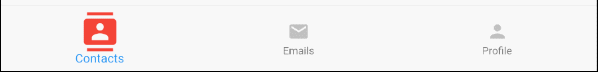
On commence par un exemple complet sur BottomNavigationBar permettant de mieux comprendre comment ce Widget fonctionne.
main.dart (ex1)
import 'package:flutter/material.dart';
void main() {
runApp(MyApp());
}
class MyApp extends StatelessWidget {
@override
Widget build(BuildContext context) {
return MaterialApp(
title: 'Title of Application',
theme: ThemeData(
primarySwatch: Colors.blue,
visualDensity: VisualDensity.adaptivePlatformDensity,
),
home: MyHomePage(),
);
}
}
class MyHomePage extends StatefulWidget {
MyHomePage({Key key}) : super(key: key);
@override
State<StatefulWidget> createState() {
return MyHomePageState();
}
}
class MyHomePageState extends State<MyHomePage> {
int selectedIndex = 0;
Widget _myContacts = MyContacts();
Widget _myEmails = MyEmails();
Widget _myProfile = MyProfile();
@override
Widget build(BuildContext context) {
return Scaffold(
appBar: AppBar(
title: Text("BottomNavigationBar Example"),
),
body: this.getBody(),
bottomNavigationBar: BottomNavigationBar(
type: BottomNavigationBarType.fixed,
currentIndex: this.selectedIndex,
items: [
BottomNavigationBarItem(
icon: Icon(Icons.contacts),
title: Text("Contacts"),
),
BottomNavigationBarItem(
icon: Icon(Icons.mail),
title: Text("Emails"),
),
BottomNavigationBarItem(
icon: Icon(Icons.person),
title: Text("Profile"),
)
],
onTap: (int index) {
this.onTapHandler(index);
},
),
);
}
Widget getBody( ) {
if(this.selectedIndex == 0) {
return this._myContacts;
} else if(this.selectedIndex==1) {
return this._myEmails;
} else {
return this._myProfile;
}
}
void onTapHandler(int index) {
this.setState(() {
this.selectedIndex = index;
});
}
}
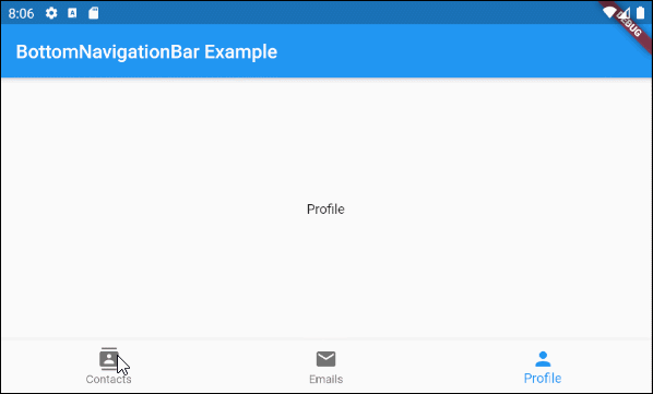
class MyContacts extends StatelessWidget {
@override
Widget build(BuildContext context) {
return Center(child: Text("Contacts"));
}
}
class MyEmails extends StatelessWidget {
@override
Widget build(BuildContext context) {
return Center(child: Text("Emails"));
}
}
class MyProfile extends StatelessWidget {
@override
Widget build(BuildContext context) {
return Center(child: Text("Profile"));
}
}3. items
La propriété items est utilisée pour définir la liste des éléments de la BottomNavigationBar. Cette propriété est obligatoire et le nombre d'éléments doit être supérieur ou égal à 2. À défaut, vous obtenez une erreur.
@required List<BottomNavigationBarItem> itemsBottomNavigationBarItem Constructor:
BottomNavigationBarItem Constructor
const BottomNavigationBarItem(
    {@required Widget icon,
    Widget title,
    Widget activeIcon,
    Color backgroundColor}
)
Par exemple:

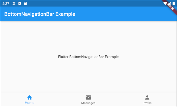
main.dart (items ex1)
import 'package:flutter/material.dart';

void main() {
  runApp(MyApp());
}

class MyApp extends StatelessWidget {
  // This widget is the root of your application.
  @override
  Widget build(BuildContext context) {
    return MaterialApp(
      title: 'Title of Application',
      theme: ThemeData(
        primarySwatch: Colors.blue,
        visualDensity: VisualDensity.adaptivePlatformDensity,
      ),
      home: MyHomePage(),
    );
  }
}

class MyHomePage extends StatelessWidget {
  MyHomePage({Key key}) : super(key: key);

  @override
  Widget build(BuildContext context) {
    return Scaffold(
      appBar: AppBar(
        title: Text("BottomNavigationBar Example"),
      ),
      body: Center(
          child:  Text(
            'Flutter BottomNavigationBar Example',
          )
      ),
      bottomNavigationBar: BottomNavigationBar(
        items: [
          BottomNavigationBarItem(
            icon: Icon(Icons.home),
            title: Text("Home"),
          ),
          BottomNavigationBarItem(
            icon: Icon(Icons.mail),
            title: Text("Messages"),
          ),
          BottomNavigationBarItem(
            icon: Icon(Icons.person),
            title: Text("Profile"),
          )
        ],
      ),
    );
  }
}
4. onTap
onTap est une fonction callback. Il est appelé quand l'utilisateur touche (tap) à un élément de la BottomNavigationBar.
ValueChanged<int> onTap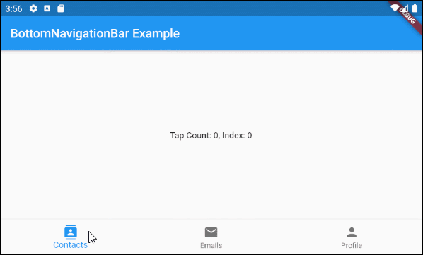
main.dart (onTab ex1)
import 'package:flutter/material.dart';

void main() {
  runApp(MyApp());
}

class MyApp extends StatelessWidget {
  @override
  Widget build(BuildContext context) {
    return MaterialApp(
      title: 'Title of Application',
      theme: ThemeData(
        primarySwatch: Colors.blue,
        visualDensity: VisualDensity.adaptivePlatformDensity,
      ),
      home: MyHomePage(),
    );
  }
}

class MyHomePage extends StatefulWidget {
  MyHomePage({Key key}) : super(key: key);

  @override
  State<StatefulWidget> createState() {
    return MyHomePageState();
  }

}

class MyHomePageState extends State<MyHomePage> {
  int tapCount = 0;
  int selectedIndex = 0;

  @override
  Widget build(BuildContext context) {
    return Scaffold(
      appBar: AppBar(
        title: Text("BottomNavigationBar Example"),
      ),
      body: Center(
          child: Text("Tap Count: " + this.tapCount.toString()
                       + ", Index: " + this.selectedIndex.toString())
      ),
      bottomNavigationBar: BottomNavigationBar(
        currentIndex: this.selectedIndex,
        items: [
          BottomNavigationBarItem(
            icon: Icon(Icons.contacts),
            title: Text("Contacts"),
          ),
          BottomNavigationBarItem(
            icon: Icon(Icons.mail),
            title: Text("Emails"),
          ),
          BottomNavigationBarItem(
            icon: Icon(Icons.person),
            title: Text("Profile"),
          )
        ],
        onTap: (int index) {
          this.onTapHandler(index);
        },
      ),
    );
  }

  void onTapHandler(int index)  {
    this.setState(() {
      this.tapCount++;
      this.selectedIndex = index;
    });
  }
}
5. currentIndex
currentIndex est l'indice de l'élément BottomNavigationBar sélectionné sur le moment. Sa valeur par défaut est 0 correspondant au premier élément.
int currentIndex: 07. iconSize
La propriété iconSize est utilisée pour spécifier la taille de l'icône de tous les BottomNavigationBarItem.
double iconSize: 24.0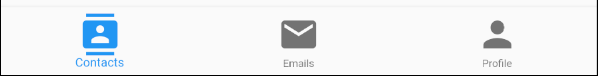
iconSize (ex1)
BottomNavigationBar(
  currentIndex: this.selectedIndex,
  iconSize: 48,
  items: [
    BottomNavigationBarItem(
      icon: Icon(Icons.contacts),
      title: Text("Contacts"),
    ),
    BottomNavigationBarItem(
      icon: Icon(Icons.mail),
      title: Text("Emails"),
    ),
    BottomNavigationBarItem(
      icon: Icon(Icons.person),
      title: Text("Profile"),
    )
  ],
  onTap: (int index) {
    this.setState(() {
      this.selectedIndex = index;
    });
  },
),
8. selectedIconTheme
La propriété selectedIconTheme est utilisée pour définir la taille (size), la couleur (color) et l'opacité (opacity) de l'icône BottomNavigationBarItem sélectionnée sur le moment.
IconThemeData selectedIconThemeIconThemeData Constructor
const IconThemeData (
    {Color color,
    double opacity,
    double size}
)
Si la propriété selectedIconTheme est utilisée, il faut spécifier la valeur pour la propriété unselectedIconTheme. Sinon, il est impossible de visualiser les icônes sur les BottomNavigationBarItem non sélectionnés.

selectedIconTheme (ex1)
BottomNavigationBar(
  currentIndex: this.selectedIndex,
  selectedIconTheme: IconThemeData (
      color: Colors.red,
      opacity: 1.0,
      size: 30
  ),
  items: [
    BottomNavigationBarItem(
      icon: Icon(Icons.contacts),
      title: Text("Contacts"),
    ),
    BottomNavigationBarItem(
      icon: Icon(Icons.mail),
      title: Text("Emails"),
    ),
    BottomNavigationBarItem(
      icon: Icon(Icons.person),
      title: Text("Profile"),
    )
  ],
  onTap: (int index) {
    this.setState(() {
      this.selectedIndex = index;
    });
  },
)
9. unselectedIconTheme
La propriété unselectedIconTheme est utilisée pour définir la taille (size), la couleur (color) et l'opacité (opacity) pour l'icône des BottomNavigationBarItem non sélectionnés.
IconThemeData unselectedIconThemeIconThemeData constructor
const IconThemeData (
    {Color color,
    double opacity,
    double size}
)
Si la propriété unselectedIconTheme est utilisée, il faut spécifier la valeur pour la propriété selectedIconTheme. À défaut, il est impossible de visualiser les icônes sur BottomNavigationBarItem sélectionnés sur le moment.
unselectedIconTheme (ex1)
BottomNavigationBar(
  currentIndex: this.selectedIndex,
  selectedIconTheme: IconThemeData (
      color: Colors.red,
      opacity: 1.0,
      size: 45
  ),
  unselectedIconTheme: IconThemeData (
      color: Colors.black45,
      opacity: 0.5,
      size: 25
  ),
  items: [
    BottomNavigationBarItem(
      icon: Icon(Icons.contacts),
      title: Text("Contacts"),
    ),
    BottomNavigationBarItem(
      icon: Icon(Icons.mail),
      title: Text("Emails"),
    ),
    BottomNavigationBarItem(
      icon: Icon(Icons.person),
      title: Text("Profile"),
    )
  ],
  onTap: (int index) {
    this.setState(() {
      this.selectedIndex = index;
    });
  },
),
10. selectedLabelStyle
La propriété selectedLabelStyle est utilisée pour spécifier le style de l'étiquette de BottomNavigationBarItem sélectionné.
TextStyle selectedLabelStyle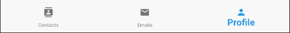
selectedLabelStyle (ex1)
BottomNavigationBar(
  currentIndex: this.selectedIndex,
  selectedLabelStyle: TextStyle(fontWeight: FontWeight.bold, fontSize: 22),
  items: [
    BottomNavigationBarItem(
      icon: Icon(Icons.contacts),
      title: Text("Contacts"),
    ),
    BottomNavigationBarItem(
      icon: Icon(Icons.mail),
      title: Text("Emails"),
    ),
    BottomNavigationBarItem(
      icon: Icon(Icons.person),
      title: Text("Profile"),
    )
  ],
  onTap: (int index) {
    this.setState(() {
      this.selectedIndex = index;
    });
  },
)
11. unselectedLabelStyle
La propriété unselectedLabelStyle est utilisée pour spécifier le style du texte affiché sur l'étiquette des BottomNavigationBarItem non sélectionnés.
TextStyle unselectedLabelStyle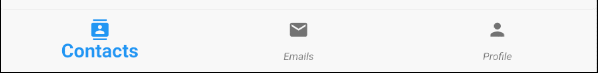
unselectedLabelStyle (ex1)
BottomNavigationBar(
  currentIndex: this.selectedIndex,
  selectedLabelStyle: TextStyle(fontWeight: FontWeight.bold, fontSize: 22),
  unselectedLabelStyle: TextStyle(fontStyle: FontStyle.italic),
  items: [
    BottomNavigationBarItem(
      icon: Icon(Icons.contacts),
      title: Text("Contacts"),
    ),
    BottomNavigationBarItem(
      icon: Icon(Icons.mail),
      title: Text("Emails"),
    ),
    BottomNavigationBarItem(
      icon: Icon(Icons.person),
      title: Text("Profile"),
    )
  ],
  onTap: (int index) {
    this.setState(() {
      this.selectedIndex = index;
    });
  },
)
12. showSelectedLabels
La propriété showSelectedLabels est utilisée pour autoriser ou interdire l'affichage des étiquettes (labels) de BottomNavigationBarItem sélectionné. Sa valeur par défaut est true.
bool showSelectedLabels: true
showSelectedLabels (ex1)
BottomNavigationBar(
  currentIndex: this.selectedIndex,
  showSelectedLabels: false,
  items: [
    BottomNavigationBarItem(
      icon: Icon(Icons.contacts),
      title: Text("Contacts"),
    ),
    BottomNavigationBarItem(
      icon: Icon(Icons.mail),
      title: Text("Emails"),
    ),
    BottomNavigationBarItem(
      icon: Icon(Icons.person),
      title: Text("Profile"),
    )
  ],
  onTap: (int index) {
    this.setState(() {
      this.selectedIndex = index;
    });
  },
)
13. showUnselectedLabels
La propriété showUnselectedLabels est utilisée pour autoriser ou interndire l'affichage des étiquettes (labels) de BottomNavigationBarItem non sélectionné. Sa valeur par défaut est true.
bool showUnselectedLabels
showUnselectedLabels (ex1)
BottomNavigationBar(
  currentIndex: this.selectedIndex,
  showUnselectedLabels: false,
  items: [
    BottomNavigationBarItem(
      icon: Icon(Icons.contacts),
      title: Text("Contacts"),
    ),
    BottomNavigationBarItem(
      icon: Icon(Icons.mail),
      title: Text("Emails"),
    ),
    BottomNavigationBarItem(
      icon: Icon(Icons.person),
      title: Text("Profile"),
    )
  ],
  onTap: (int index) {
    this.setState(() {
      this.selectedIndex = index;
    });
  },
)
14. selectedFontSize
La propriété selectedFontSize est utilisée pour spécifier la taille de police de BottomNavigationBarItem sélectionné. Sa valeur par défaut est 14.
double selectedFontSize: 14.0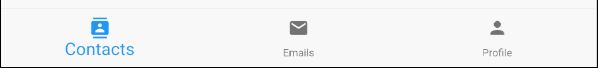
selectedFontSize (ex1)
BottomNavigationBar(
  currentIndex: this.selectedIndex,
  selectedFontSize: 20,
  items: [
    BottomNavigationBarItem(
      icon: Icon(Icons.contacts),
      title: Text("Contacts"),
    ),
    BottomNavigationBarItem(
      icon: Icon(Icons.mail),
      title: Text("Emails"),
    ),
    BottomNavigationBarItem(
      icon: Icon(Icons.person),
      title: Text("Profile"),
    )
  ],
  onTap: (int index) {
    this.setState(() {
      this.selectedIndex = index;
    });
  },
)
15. unselectedFontSize
La propriété selectedFontSize est utilisée pour spécifier la taille de police des BottomNavigationBarItem non sélectionnés. Sa valeur par défaut est 12.
double unselectedFontSize: 12.0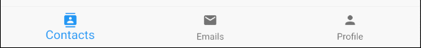
unselectedFontSize (ex1)
BottomNavigationBar(
  currentIndex: this.selectedIndex,
  selectedFontSize: 20,
  unselectedFontSize: 15,
  items: [
    BottomNavigationBarItem(
      icon: Icon(Icons.contacts),
      title: Text("Contacts"),
    ),
    BottomNavigationBarItem(
      icon: Icon(Icons.mail),
      title: Text("Emails"),
    ),
    BottomNavigationBarItem(
      icon: Icon(Icons.person),
      title: Text("Profile"),
    )
  ],
  onTap: (int index) {
    this.setState(() {
      this.selectedIndex = index;
    });
  },
)
16. backgroundColor
La propriété backgroundColor est utilisée pour spécifier la couleur du fond d'écran de BottomNavigationBar.
Color backgroundColor
backgroundColor (ex1)
BottomNavigationBar(
  currentIndex: this.selectedIndex,
  backgroundColor : Colors.greenAccent,
  items: [
    BottomNavigationBarItem(
      icon: Icon(Icons.contacts),
      title: Text("Contacts"),
    ),
    BottomNavigationBarItem(
      icon: Icon(Icons.mail),
      title: Text("Emails"),
    ),
    BottomNavigationBarItem(
      icon: Icon(Icons.person),
      title: Text("Profile"),
    )
  ],
  onTap: (int index) {
    this.setState(() {
      this.selectedIndex = index;
    });
  },
)
17. selectedItemColor
La propriété selectedItemColor est utilisée pour spécifier la couleur de BottomNavigationBarItem sélectionné, qui fonctionne pour l'icône et l'étiquette.
Remarque: La propriété selectedItemColor est identique à fixedColor, vous n'avez droit qu'à une de ces deux propriétés.
Color selectedItemColor
selectedItemColor (ex1)
BottomNavigationBar(
  currentIndex: this.selectedIndex,
  selectedItemColor : Colors.red,
  items: [
    BottomNavigationBarItem(
      icon: Icon(Icons.contacts),
      title: Text("Contacts"),
    ),
    BottomNavigationBarItem(
      icon: Icon(Icons.mail),
      title: Text("Emails"),
    ),
    BottomNavigationBarItem(
      icon: Icon(Icons.person),
      title: Text("Profile"),
    )
  ],
  onTap: (int index) {
    this.setState(() {
      this.selectedIndex = index;
    });
  },
)
18. unselectedItemColor
La propriété unselectedItemColor est utilisée pour spécifier la couleur des BottomNavigationBarItem non sélectionnés. Elle fonctionne pour l'icône et l'étiquette.
Color unselectedItemColor
unselectedItemColor (ex1)
BottomNavigationBar(
  currentIndex: this.selectedIndex,
  selectedItemColor : Colors.red,
  unselectedItemColor: Colors.cyan,
  items: [
    BottomNavigationBarItem(
      icon: Icon(Icons.contacts),
      title: Text("Contacts"),
    ),
    BottomNavigationBarItem(
      icon: Icon(Icons.mail),
      title: Text("Emails"),
    ),
    BottomNavigationBarItem(
      icon: Icon(Icons.person),
      title: Text("Profile"),
    )
  ],
  onTap: (int index) {
    this.setState(() {
      this.selectedIndex = index;
    });
  },
)
19. fixedColor
La propriété fixedColor est identique à la propriété selectedItemColor. Les deux sont utilisées pour spécifier la couleur de BottomNavigationBarItem sélectionné. Elles fonctionnent pour l'icône et l'étiquette.
Remarque: fixedColor est un vieux nom disponible à des fins de comptabilité ascendante (backwards compatibility). Il est possible d'utiliser la propriété selectedItemColor, et interdit d'utiliser les deux en même temps.
Color fixedColor
fixedColor (ex1)
BottomNavigationBar(
  currentIndex: this.selectedIndex,
  fixedColor: Colors.red,
  items: [
    BottomNavigationBarItem(
      icon: Icon(Icons.contacts),
      title: Text("Contacts"),
    ),
    BottomNavigationBarItem(
      icon: Icon(Icons.mail),
      title: Text("Emails"),
    ),
    BottomNavigationBarItem(
      icon: Icon(Icons.person),
      title: Text("Profile"),
    )
  ],
  onTap: (int index) {
    this.setState(() {
      this.selectedIndex = index;
    });
  },
)Tutoriels de programmation Flutter
- Le Tutoriel de Flutter Column
- Le Tutoriel de Flutter Stack
- Le Tutoriel de Flutter IndexedStack
- Le Tutoriel de Flutter Spacer
- Le Tutoriel de Flutter Expanded
- Le Tutoriel de Flutter SizedBox
- Le Tutoriel de Flutter Tween
- Installer Flutter SDK sur Windows
- Installer Flutter Plugin pour Android Studio
- Créez votre première application Flutter - Hello Flutter
- Le Tutoriel de Flutter Scaffold
- Le Tutoriel de Flutter AppBar
- Le Tutoriel de Flutter BottomAppBar
- Le Tutoriel de Flutter TextButton
- Le Tutoriel de Flutter ElevatedButton
- Le Tutoriel de Flutter EdgeInsetsGeometry
- Le Tutoriel de Flutter EdgeInsets
- Le Tutoriel de CircularProgressIndicator
- Le Tutoriel de Flutter LinearProgressIndicator
- Le Tutoriel de Flutter Center
- Le Tutoriel de Flutter Align
- Le Tutoriel de Flutter Row
- Le Tutoriel de Flutter SplashScreen
- Le Tutoriel de Flutter Alignment
- Le Tutoriel de Flutter Positioned
- Le Tutoriel de Flutter SimpleDialog
- Le Tutoriel de Flutter AlertDialog
- Navigation et Routing dans Flutter
- Le Tutoriel de Flutter TabBar
- Le Tutoriel de Flutter Banner
- Le Tutoriel de Flutter BottomNavigationBar
- Le Tutoriel de Flutter FancyBottomNavigation
- Le Tutoriel de Flutter Card
- Le Tutoriel de Flutter Border
- Le Tutoriel de Flutter ContinuousRectangleBorder
- Le Tutoriel de Flutter RoundedRectangleBorder
- Le Tutoriel de Flutter CircleBorder
- Le Tutoriel de Flutter StadiumBorder
- Le Tutoriel de Flutter Container
- Le Tutoriel de Flutter RotatedBox
- Le Tutoriel de Flutter CircleAvatar
- Le Tutoriel de Flutter IconButton
- Le Tutoriel de Flutter FlatButton
- Le Tutoriel de Flutter SnackBar
Show More