Le Tutoriel de CircularProgressIndicator
1. CircularProgressIndicator
CircularProgressIndicator est une sous-classe de ProgressIndicator. Il crée un indicateur de progrès circulaire.
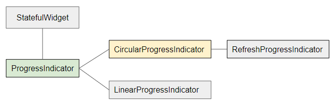
- LinearProgressIndicator
- ProgressIndicator
CircularProgressIndicator est divisé en deux types:
Determinate
Determinate (Déterminé): un indicateur de progrès qui indique à l'utilisateur le pourcentage de travail achevé en fonction de la valeur de la propriété value (dans la fourchette de 0 et 1).
Indeterminate
Indeterminate (Indéterminé): un indicateur de progression qui n'identifie ni le pourcentage de travail achevé, ni l'heure de fin.
CircularProgressIndicator Constructor:
CircularProgressIndicator constructor
const CircularProgressIndicator(
    {Key key,
    double value,
    Color backgroundColor,
    Animation<Color> valueColor,
    double strokeWidth: 4.0,
    String semanticsLabel,
    String semanticsValue}
)
2. Example: Indeterminate
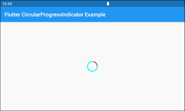
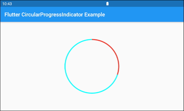
À commencer par un exemple simple, un CircularProgressIndicator simule un processus actif mais ne connaît pas le pourcentage de travail qui a été terminé et ne sait pas quand terminer.
main.dart (ex 1)
import 'package:flutter/material.dart';

void main() => runApp(MyApp());

class MyApp extends StatelessWidget {
  @override
  Widget build(BuildContext context) {
    return MaterialApp(
      title: 'o7planning.org',
      debugShowCheckedModeBanner: false,
      home: HomePage(),
    );
  }
}

class HomePage extends StatelessWidget {

  @override
  Widget build(BuildContext context) {
    return Scaffold(
      appBar: AppBar(
        title: Text('Flutter CircularProgressIndicator Example'),
      ),
      body: Center(
        child:  CircularProgressIndicator(
          backgroundColor: Colors.cyanAccent,
          valueColor: new AlwaysStoppedAnimation<Color>(Colors.red),
        ),
      ),
    );
  }
}
Par défaut, CircularProgressIndicator a un rayon assez petit, mais si vous souhaitez personnaliser la taille, il faut la mettre dans une SizedBox.
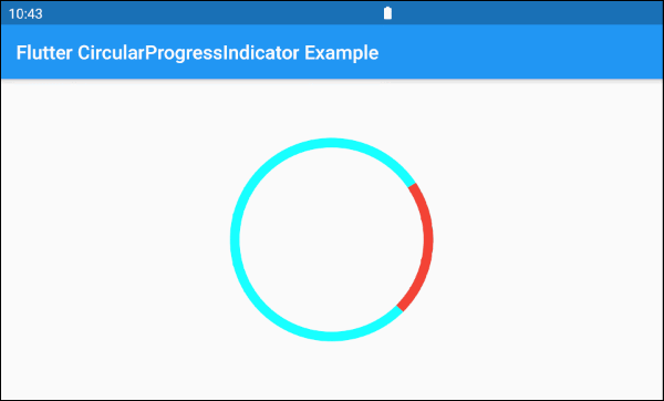
SizedBox(
  width: 200,
  height: 200,
  child: CircularProgressIndicator(
    strokeWidth: 10,
    backgroundColor: Colors.cyanAccent,
    valueColor: new AlwaysStoppedAnimation<Color>(Colors.red),
  ),
)
Le paramètre valueColor est utilisé pour spécifier une animation de couleur à la progression de CircularProgressIndicator, par exemple:
valueColor: new AlwaysStoppedAnimation<Color>(Colors.red)AlwaysStoppedAnimation<Color> arrêtera toujours l'animation de CircularProgressIndicator si le paramètre value est une valeur spécifique, non null.
SizedBox(
  width: 200,
  height: 200,
  child: CircularProgressIndicator(
    value: 0.3,
    backgroundColor: Colors.cyanAccent,
    valueColor: new AlwaysStoppedAnimation<Color>(Colors.red),
  ),
)
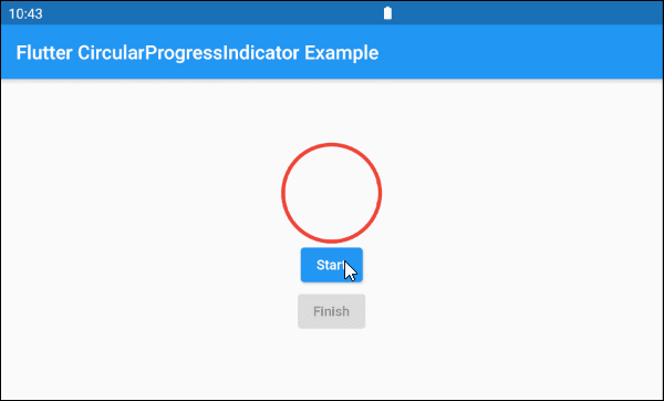
En se basant sur des fonctionnalités susmentionnées des paramètres value et valueColor, vous pouvez contrôler le comportement de CircularProgressIndicator. Ci-dessous un exemple:
main.dart (ex 1d)
import 'package:flutter/material.dart';

void main() => runApp(MyApp());

class MyApp extends StatelessWidget {
  @override
  Widget build(BuildContext context) {
    return MaterialApp(
      title: 'o7planning.org',
      debugShowCheckedModeBanner: false,
      home: HomePage(),
    );
  }
}

class HomePage extends StatefulWidget {

  @override
  State<StatefulWidget> createState() {
    return _HomePageState();
  }
}

class _HomePageState extends State<HomePage> {

  bool _working = false;

  void startWorking() async {
    this.setState(() {
      this._working = true;
    });
  }

  void finishWorking() {
    this.setState(() {
      this._working = false;
    });
  }

  @override
  Widget build(BuildContext context) {
    return Scaffold(
      appBar: AppBar(
        title: Text('Flutter CircularProgressIndicator Example'),
      ),
      body: Center(
          child:  Column (
              mainAxisAlignment: MainAxisAlignment.center,
              children:  [
                SizedBox(
                  width: 100,
                  height: 100,
                  child: CircularProgressIndicator(
                    value: this._working? null: 1,
                    backgroundColor: Colors.cyanAccent,
                    valueColor: new AlwaysStoppedAnimation<Color>(Colors.red),
                  ),
                ),
                ElevatedButton(
                    child: Text("Start"),
                    onPressed: this._working? null: () {
                      this.startWorking();
                    }
                ),
                ElevatedButton(
                    child: Text("Finish"),
                    onPressed: !this._working? null: () {
                      this.finishWorking();
                    }
                )
              ]
          )
      ),
    );
  }
}
3. Example: Determinate
L'exemple ci-dessous utilise CircularProgressIndicator pour afficher une progression avec le pourcentage de travail terminé. Le paramètre value a une valeur comprise entre 0 et 1.
main.dart (ex 2)
import 'package:flutter/material.dart';

void main() => runApp(MyApp());

class MyApp extends StatelessWidget {
  @override
  Widget build(BuildContext context) {
    return MaterialApp(
      title: 'o7planning.org',
      debugShowCheckedModeBanner: false,
      home: HomePage(),
    );
  }
}

class HomePage extends StatefulWidget {

  @override
  State<StatefulWidget> createState() {
    return _HomePageState();
  }
}

class _HomePageState extends State<HomePage> {

  double _value = 0;
  bool _working = false;

  void startWorking()  async {
    this.setState(() {
      this._working = true;
      this._value = 0;
    });
    for(int i = 0; i< 10; i++) {
      if(!this._working)  {
         break;
      }
      await Future.delayed(Duration(seconds: 1));
      this.setState(() {
        this._value += 0.1;
      });
    }
    this.setState(() {
      this._working = false;
    });
  }

  void stopWorking() {
    this.setState(() {
      this._working = false;
    });
  }

  @override
  Widget build(BuildContext context) {
    return Scaffold(
      appBar: AppBar(
        title: Text('Flutter CircularProgressIndicator Example'),
      ),
      body: Center(
          child:  Column (
              mainAxisAlignment: MainAxisAlignment.center,
              children:  [
                SizedBox(
                  width: 100,
                  height: 100,
                  child: CircularProgressIndicator(
                    value: this._value,
                    backgroundColor: Colors.cyanAccent,
                    valueColor: new AlwaysStoppedAnimation<Color>(Colors.red),
                  ),
                ),
                Text(
                  "Percent: " + (this._value * 100).round().toString()+ "%",
                  style: TextStyle(fontSize: 20),
                ),
                ElevatedButton(
                    child: Text("Start"),
                    onPressed: this._working? null: () {
                      this.startWorking();
                    }
                ),
                ElevatedButton(
                    child: Text("Stop"),
                    onPressed: !this._working? null: () {
                      this.stopWorking();
                    }
                )
              ]
          )
      ),
    );
  }
}
4. backgroundColor
backgroundColor est utilisé pour définir la couleur d'arrière-plan de CircularProgressIndicator.
Color backgroundColor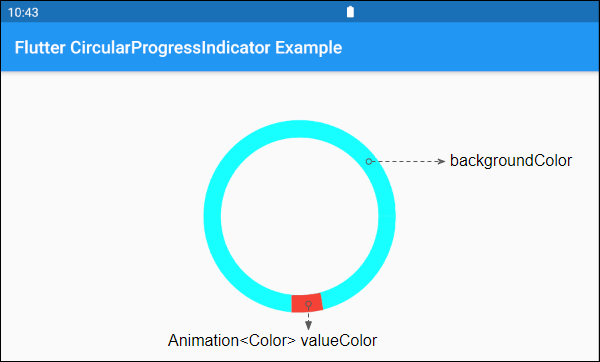
6. valueColor
valueColor est utilisé pour spécifier une animation de couleur à la progression.
Animation<Color> valueColor
Par exemple:
CircularProgressIndicator(
  strokeWidth: 20,
  backgroundColor: Colors.cyanAccent,
  valueColor: new AlwaysStoppedAnimation<Color>(Colors.red),
)- Le Tutoriel de Flutter Animation
7. strokeWidth
strokeWidth est la largeur du trait de cercle. Sa valeur par défaut est de 4 pixel(s).
double strokeWidth: 4.08. semanticsLabel
semanticsLabel est utilisé pour décrire l'utilisation prévue de CircularProgressIndicator, qui est complètement caché sur l'interface et est utile pour les lecteurs d'écran, tels que les lecteurs d'écran pour les malvoyants.
String semanticsLabel9. semanticsValue
semanticsValue est complètement masquée à l'écran. Son objectif est de fournir des informations sur la progression actuelle des lecteurs d'écran.
Par défaut, la valeur de la semanticsValue est le pourcentage du travail terminé, par exemple, la valeur de la propriété value est 0,3, ce qui signifie que la semanticsValue est "30%".
String semanticsValueVí dụ:
CircularProgressIndicator(
  value: this._value,
  backgroundColor: Colors.cyanAccent,
  valueColor: new AlwaysStoppedAnimation<Color>(Colors.red),
  semanticsLabel: "Downloading file abc.mp3",
  semanticsValue: "Percent " + (this._value * 100).toString() + "%",
)
Tutoriels de programmation Flutter
- Le Tutoriel de Flutter Column
- Le Tutoriel de Flutter Stack
- Le Tutoriel de Flutter IndexedStack
- Le Tutoriel de Flutter Spacer
- Le Tutoriel de Flutter Expanded
- Le Tutoriel de Flutter SizedBox
- Le Tutoriel de Flutter Tween
- Installer Flutter SDK sur Windows
- Installer Flutter Plugin pour Android Studio
- Créez votre première application Flutter - Hello Flutter
- Le Tutoriel de Flutter Scaffold
- Le Tutoriel de Flutter AppBar
- Le Tutoriel de Flutter BottomAppBar
- Le Tutoriel de Flutter TextButton
- Le Tutoriel de Flutter ElevatedButton
- Le Tutoriel de Flutter EdgeInsetsGeometry
- Le Tutoriel de Flutter EdgeInsets
- Le Tutoriel de CircularProgressIndicator
- Le Tutoriel de Flutter LinearProgressIndicator
- Le Tutoriel de Flutter Center
- Le Tutoriel de Flutter Align
- Le Tutoriel de Flutter Row
- Le Tutoriel de Flutter SplashScreen
- Le Tutoriel de Flutter Alignment
- Le Tutoriel de Flutter Positioned
- Le Tutoriel de Flutter SimpleDialog
- Le Tutoriel de Flutter AlertDialog
- Navigation et Routing dans Flutter
- Le Tutoriel de Flutter TabBar
- Le Tutoriel de Flutter Banner
- Le Tutoriel de Flutter BottomNavigationBar
- Le Tutoriel de Flutter FancyBottomNavigation
- Le Tutoriel de Flutter Card
- Le Tutoriel de Flutter Border
- Le Tutoriel de Flutter ContinuousRectangleBorder
- Le Tutoriel de Flutter RoundedRectangleBorder
- Le Tutoriel de Flutter CircleBorder
- Le Tutoriel de Flutter StadiumBorder
- Le Tutoriel de Flutter Container
- Le Tutoriel de Flutter RotatedBox
- Le Tutoriel de Flutter CircleAvatar
- Le Tutoriel de Flutter IconButton
- Le Tutoriel de Flutter FlatButton
- Le Tutoriel de Flutter SnackBar
Show More