Le Tutoriel de Flutter Card
1. Card
Dans Flutter, Card est un widget utilisé pour créer une zone rectangulaire avec quatre coins arrondis et un effet d'ombre sur ses bords. Card contient des informations telles que l'album, l'emplacement géographique, les coordonnées, etc.
Card Constructor
const Card(
{Key key,
Widget child,
Color color,
Color shadowColor,
double elevation,
ShapeBorder shape,
bool borderOnForeground: true,
EdgeInsetsGeometry margin,
Clip clipBehavior,
bool semanticContainer: true}
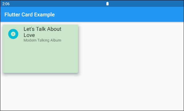
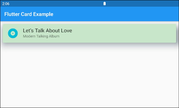
)Par exemple:

main.dart (ex1)
import 'package:flutter/material.dart';

void main() {
  runApp(MyApp());
}

class MyApp extends StatelessWidget {

  @override
  Widget build(BuildContext context) {
    return MaterialApp(
      title: 'o7planning.org',
      debugShowCheckedModeBanner: false,
      theme: ThemeData(
        primarySwatch: Colors.blue,
        visualDensity: VisualDensity.adaptivePlatformDensity,
      ),
      home: MyHomePage(),
    );
  }
}

class MyHomePage extends StatelessWidget {
  MyHomePage({Key key}) : super(key: key);

  @override
  Widget build(BuildContext context) {
    return Scaffold(
      appBar: AppBar(
          title: Text("Flutter Card Example")
      ),
      body: Card (
        margin: EdgeInsets.all(10),
        color: Colors.green[100],
        shadowColor: Colors.blueGrey,
        elevation: 10,
        child: Column(
          mainAxisSize: MainAxisSize.min,
          children: <Widget>[
            const ListTile(
              leading: Icon (
                  Icons.album,
                  color: Colors.cyan,
                  size: 45
              ),
              title: Text(
                "Let's Talk About Love",
                style: TextStyle(fontSize: 20),
              ),
              subtitle: Text('Modern Talking Album'),
            ),
          ],
        ),
      ),
    );
  }
}
Si vous souhaitez personnaliser la taille Card, il faut la placer dans un Container ou une SizedBox.
SizedBox (
  width: 300,
  height: 200,
  child: Card (
    margin: EdgeInsets.all(10),
    color: Colors.green[100],
    shadowColor: Colors.blueGrey,
    elevation: 10,
    child: Column(
      mainAxisSize: MainAxisSize.min,
      children: <Widget>[
        const ListTile(
          leading: Icon (
              Icons.album,
              color: Colors.cyan,
              size: 45
          ),
          title: Text(
            "Let's Talk About Love",
            style: TextStyle(fontSize: 20),
          ),
          subtitle: Text('Modern Talking Album'),
        ),
      ],
    ),
  ),
)
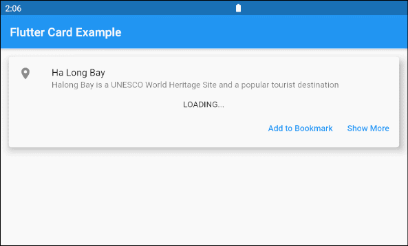
2. Card Example
Un exemple de Card example avec une interface plus compliquée:
main.dart (ex3)
import 'package:flutter/material.dart';
import 'dart:async';

void main() {
  runApp(MyApp());
}

class MyApp extends StatelessWidget {

  @override
  Widget build(BuildContext context) {
    return MaterialApp(
      title: 'o7planning.org',
      debugShowCheckedModeBanner: false,
      theme: ThemeData(
        primarySwatch: Colors.blue,
        visualDensity: VisualDensity.adaptivePlatformDensity,
      ),
      home: MyHomePage(),
    );
  }
}

class MyHomePage extends StatelessWidget {
  MyHomePage({Key key}) : super(key: key);

  Future<Widget> getImage() async {
    final Completer<Widget> completer = Completer();
    final url = 'https://s3.o7planning.com/images/ha-long-bay.png';
    final image = NetworkImage(url);
    //
    final load = image.resolve(const ImageConfiguration());

    // Delay 1 second.
    await Future.delayed(Duration(seconds: 1));

    final listener = new ImageStreamListener((ImageInfo info, isSync) async {
      print(info.image.width);
      print(info.image.height);
      completer.complete(Container(child: Image(image: image)));
    });

    load.addListener(listener);
    return completer.future;
  }

  @override
  Widget build(BuildContext context) {
    return Scaffold(
        appBar: AppBar(
            title: Text("Flutter Card Example")
        ),
        body: Container(
            margin: EdgeInsets.all(10) ,
            child: Column(
              children: <Widget>[
                Card(
                  child: Column(
                    mainAxisSize: MainAxisSize.min,
                    children: <Widget>[
                      const ListTile(
                        leading: Icon(Icons.place),
                        title: Text('Ha Long Bay'),
                        subtitle: Text('Halong Bay is a UNESCO World Heritage Site and a popular tourist destination'),
                      ),
                      Container(
                        alignment: Alignment.center,
                        child: FutureBuilder<Widget>(
                          future: getImage(),
                          builder: (context, snapshot) {
                            if (snapshot.hasData) {
                              return snapshot.data;
                            } else {
                              return Text('LOADING...');
                            }
                          },
                        ),
                      ) ,
                      ButtonBarTheme ( // make buttons use the appropriate styles for cards
                        data: ButtonBarThemeData(),
                        child: ButtonBar(
                          children: <Widget>[
                            TextButton(
                              child: const Text('Add to Bookmark'),
                              onPressed: () {},
                            ),
                            TextButton(
                              child: const Text('Show More'),
                              onPressed: () {},
                            ),
                          ],
                        ),
                      ),
                    ],
                  ),
                  elevation: 10,
                ),
              ],
            )
        )
    );
  }
}4. color
La propriété color est utilisée pour définir la couleur d'arrière-plan de Card.
Si cette propriété est null, donc CardTheme.color de ThemeData.cardTheme est utilisée. Si CardTheme.color est également null, donc ThemeData.cardColor est utilisée.
Color color5. shadowColor
shadowColor est la couleur utilisée pour dessiner les ombres (shadows) de Card.
Color shadowColor6. elevation
elevation correspond aux coordonnées le long de l'axe Z de Card, ce qui affecte la taille de l'ombre (shadow) de Card.
Si cette propriété est null, alors CardTheme.elevation de ThemeData.cardTheme est utilisée. Si CardTheme.elevation est également null, la valeur par défaut est 1.0.
double elevationPar exemple:
elevation (ex1)
Card (
  margin: EdgeInsets.all(10),
  color: Colors.green[100],
  shadowColor: Colors.blueGrey,
  elevation: 20,
  child: Column(
    mainAxisSize: MainAxisSize.min,
    children: <Widget>[
      const ListTile(
        leading: Icon (
            Icons.album,
            color: Colors.cyan,
            size: 45
        ),
        title: Text(
          "Let's Talk About Love",
          style: TextStyle(fontSize: 20),
        ),
        subtitle: Text('Modern Talking Album'),
      ),
    ],
  ),
)
7. shape
La propriété shape est utilisée pour définir la forme de la bordure de Card.
Si cette propriété est null, CardTheme.shape de ThemeData.cardTheme est utilisée. Si CardTheme.shape est également null, la forme sera un RoundedRectangleBorder avec un rayon de coin circulaire de 4,0.
ShapeBorder shape- Le Tutoriel de Flutter ShapeBorder
Par exemple:
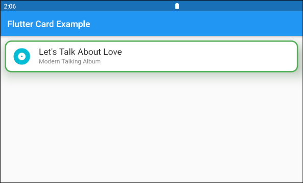
shape (ex1)
Card (
  margin: EdgeInsets.all(10),
  elevation: 20,
  shape: RoundedRectangleBorder(
      side:  BorderSide(color: Colors.green,width: 3),
      borderRadius: BorderRadius.all(Radius.circular(15))
  ),
  shadowColor: Colors.green[100],
  child: Column(
    mainAxisSize: MainAxisSize.min,
    children: <Widget>[
      const ListTile(
        leading: Icon (
            Icons.album,
            color: Colors.cyan,
            size: 45
        ),
        title: Text(
          "Let's Talk About Love",
          style: TextStyle(fontSize: 20),
        ),
        subtitle: Text('Modern Talking Album'),
      ),
    ],
  ),
)
8. borderOnForeground
Si borderOnForeground est true, la bordure de shape sera dessinée devant child. Vice versa, une bordure sera dessinée derrière child.
bool borderOnForeground: true9. margin
La propriété margin est utilisée pour créer un espace vide autour de Card.
EdgeInsetsGeometry marginTutoriels de programmation Flutter
- Le Tutoriel de Flutter Column
- Le Tutoriel de Flutter Stack
- Le Tutoriel de Flutter IndexedStack
- Le Tutoriel de Flutter Spacer
- Le Tutoriel de Flutter Expanded
- Le Tutoriel de Flutter SizedBox
- Le Tutoriel de Flutter Tween
- Installer Flutter SDK sur Windows
- Installer Flutter Plugin pour Android Studio
- Créez votre première application Flutter - Hello Flutter
- Le Tutoriel de Flutter Scaffold
- Le Tutoriel de Flutter AppBar
- Le Tutoriel de Flutter BottomAppBar
- Le Tutoriel de Flutter TextButton
- Le Tutoriel de Flutter ElevatedButton
- Le Tutoriel de Flutter EdgeInsetsGeometry
- Le Tutoriel de Flutter EdgeInsets
- Le Tutoriel de CircularProgressIndicator
- Le Tutoriel de Flutter LinearProgressIndicator
- Le Tutoriel de Flutter Center
- Le Tutoriel de Flutter Align
- Le Tutoriel de Flutter Row
- Le Tutoriel de Flutter SplashScreen
- Le Tutoriel de Flutter Alignment
- Le Tutoriel de Flutter Positioned
- Le Tutoriel de Flutter SimpleDialog
- Le Tutoriel de Flutter AlertDialog
- Navigation et Routing dans Flutter
- Le Tutoriel de Flutter TabBar
- Le Tutoriel de Flutter Banner
- Le Tutoriel de Flutter BottomNavigationBar
- Le Tutoriel de Flutter FancyBottomNavigation
- Le Tutoriel de Flutter Card
- Le Tutoriel de Flutter Border
- Le Tutoriel de Flutter ContinuousRectangleBorder
- Le Tutoriel de Flutter RoundedRectangleBorder
- Le Tutoriel de Flutter CircleBorder
- Le Tutoriel de Flutter StadiumBorder
- Le Tutoriel de Flutter Container
- Le Tutoriel de Flutter RotatedBox
- Le Tutoriel de Flutter CircleAvatar
- Le Tutoriel de Flutter IconButton
- Le Tutoriel de Flutter FlatButton
- Le Tutoriel de Flutter SnackBar
Show More