Le Tutoriel de Flutter BottomAppBar
1. BottomAppBar
Un menu en bas (bottom) est un style traditionnel des applications iOS. Dans Flutter, vous pouvez le faire avec BottomAppBar. En plus, BottomAppBar dispose d'une fonctionnalité très pratique permettant de lui attacher un FloatingActionButton.
BottomAppBar Constructor:
BottomAppBar constructor
const BottomAppBar(
    {Key key,
    Color color,
    double elevation,
    NotchedShape shape,
    Clip clipBehavior: Clip.none,
    double notchMargin: 4.0,
    Widget child}
)
En général, BottomAppBar est placé dans un Scaffold via la propriété AppBar.bottomNavigationBar et elle apparaître en bas d'un Scaffold.
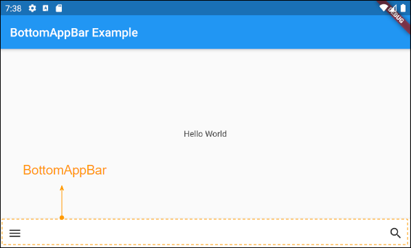
2. child
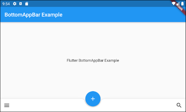
child est la propriété la plus importante de BottomAppBar. Dans la plupart des cas d'utilisation, c'est une Row, et cet objet Row contient un ou plusieurs sub Widget(s) tels que IconButton, PopupMenuButton, etc.
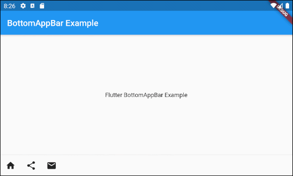
Widget childUn exemple d'une BottomAppBar dont les actions sont IconButton(s) et PopupMenuButton(s).
main.dart (child - ex1)
import 'package:flutter/material.dart';
void main() {
runApp(MyApp());
}
class MyApp extends StatelessWidget {
// This widget is the root of your application.
@override
Widget build(BuildContext context) {
return MaterialApp(
title: 'Title of Application',
theme: ThemeData(
primarySwatch: Colors.blue,
visualDensity: VisualDensity.adaptivePlatformDensity,
),
home: MyHomePage(),
);
}
}
class MyHomePage extends StatelessWidget {
MyHomePage({Key key}) : super(key: key);
@override
Widget build(BuildContext context) {
return Scaffold(
appBar: AppBar(
title: Text("BottomAppBar Example"),
),
body: Center(
child: Text(
'Flutter BottomAppBar Example',
)
),
bottomNavigationBar: BottomAppBar(
child: new Row(
mainAxisSize: MainAxisSize.max,
mainAxisAlignment: MainAxisAlignment.start,
children: <Widget>[
IconButton(icon: Icon(Icons.home), onPressed: () {},),
PopupMenuButton(
icon: Icon(Icons.share),
itemBuilder: (context) => [
PopupMenuItem(
value: 1,
child: Text("Facebook"),
),
PopupMenuItem(
value: 2,
child: Text("Instagram"),
),
],
),
IconButton(icon: Icon(Icons.email), onPressed: () {},),
],
),
)
);
}
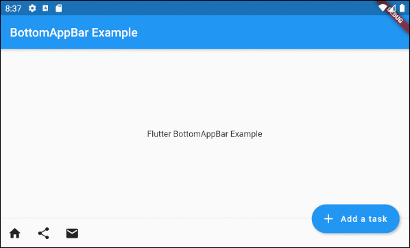
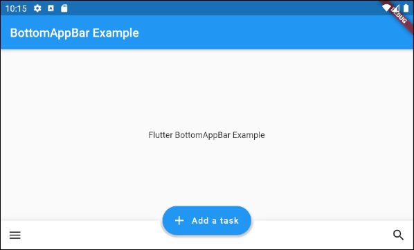
}Afin d'étendre l'exemple ci-dessus, on attache un FloatingActionButton à droite de la BottomAppBar.
main.dart (child ex2)
import 'package:flutter/material.dart';
void main() {
runApp(MyApp());
}
class MyApp extends StatelessWidget {
// This widget is the root of your application.
@override
Widget build(BuildContext context) {
return MaterialApp(
title: 'Title of Application',
theme: ThemeData(
primarySwatch: Colors.blue,
visualDensity: VisualDensity.adaptivePlatformDensity,
),
home: MyHomePage(),
);
}
}
class MyHomePage extends StatelessWidget {
MyHomePage({Key key}) : super(key: key);
@override
Widget build(BuildContext context) {
return Scaffold(
appBar: AppBar(
title: Text("BottomAppBar Example"),
),
body: Center(
child: Text(
'Flutter BottomAppBar Example',
)
),
floatingActionButton: FloatingActionButton.extended (
elevation: 4.0,
icon: const Icon(Icons.add),
label: const Text('Add a task'),
onPressed: () {},
),
floatingActionButtonLocation: FloatingActionButtonLocation.endDocked,
bottomNavigationBar: BottomAppBar(
child: new Row(
mainAxisSize: MainAxisSize.max,
mainAxisAlignment: MainAxisAlignment.start,
children: <Widget>[
IconButton(icon: Icon(Icons.home), onPressed: () {},),
PopupMenuButton(
icon: Icon(Icons.share),
itemBuilder: (context) => [
PopupMenuItem(
value: 1,
child: Text("Facebook"),
),
PopupMenuItem(
value: 2,
child: Text("Instagram"),
),
],
),
IconButton(icon: Icon(Icons.email), onPressed: () {},),
],
),
)
);
}
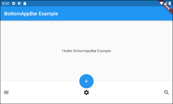
}Par exemple: Une BottomAppBar avec un FloatingActionButton ancré au milieu.

main.dart (child ex3)
import 'package:flutter/material.dart';

void main() {
  runApp(MyApp());
}

class MyApp extends StatelessWidget {
  // This widget is the root of your application.
  @override
  Widget build(BuildContext context) {
    return MaterialApp(
      title: 'Title of Application',
      theme: ThemeData(
        primarySwatch: Colors.blue,
        visualDensity: VisualDensity.adaptivePlatformDensity,
      ),
      home: MyHomePage(),
    );
  }
}

class MyHomePage extends StatelessWidget {
  MyHomePage({Key key}) : super(key: key);

  @override
  Widget build(BuildContext context) {
    return Scaffold(
        appBar: AppBar(
          title: Text("BottomAppBar Example"),
        ),
        body: Center(
            child:  Text(
              'Flutter BottomAppBar Example',
            )
        ),
        floatingActionButton: FloatingActionButton(
          onPressed: () { },
          tooltip: 'Increment',
          child: Icon(Icons.add),
          elevation: 2.0,
        ),
        floatingActionButtonLocation: FloatingActionButtonLocation.centerDocked,
        bottomNavigationBar: BottomAppBar(
          child: new Row(
            mainAxisSize: MainAxisSize.max,
            mainAxisAlignment: MainAxisAlignment.spaceBetween,
            children: <Widget>[
              IconButton(icon: Icon(Icons.menu), onPressed: () {},),
              IconButton(icon: Icon(Icons.search), onPressed: () {},),
            ],
          ),
        )
    );
  }
}
Exemple: Personnaliser la hauteur de la BottomAppBar:
main.dart (child ex4)
import 'package:flutter/material.dart';

void main() {
  runApp(MyApp());
}

class MyApp extends StatelessWidget {
  // This widget is the root of your application.
  @override
  Widget build(BuildContext context) {
    return MaterialApp(
      title: 'Title of Application',
      theme: ThemeData(
        primarySwatch: Colors.blue,
        visualDensity: VisualDensity.adaptivePlatformDensity,
      ),
      home: MyHomePage(),
    );
  }
}

class MyHomePage extends StatelessWidget {
  MyHomePage({Key key}) : super(key: key);

  @override
  Widget build(BuildContext context) {
    return Scaffold(
        appBar: AppBar(
          title: Text("BottomAppBar Example"),
        ),
        body: Center(
            child:  Text(
              'Flutter BottomAppBar Example',
            )
        ),
        floatingActionButton: FloatingActionButton(
          onPressed: () { },
          tooltip: 'Increment',
          child: Icon(Icons.add),
          elevation: 2.0,
        ),
        floatingActionButtonLocation: FloatingActionButtonLocation.centerDocked,
        bottomNavigationBar: BottomAppBar(
          child: Container(
            height: 90.0,
            child: new Row(
              mainAxisSize: MainAxisSize.max,
              mainAxisAlignment: MainAxisAlignment.spaceBetween,
              children: <Widget>[
                IconButton(icon: Icon(Icons.menu), onPressed: () {},),
                IconButton(icon: Icon(Icons.settings), onPressed: () {},),
                IconButton(icon: Icon(Icons.search), onPressed: () {},),
              ],
            ),
          )
        )
    );
  }
}
3. shape
La propriété shape est utilisée pour définir la forme de l'encoche (notch) lorsque FloatingActionButton est placé sur une BottomAppBar.
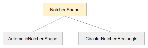
NotchedShape shapeNotchedShape est une classe abstraite (abstract class), qui dispose de deux sous-classes CircularNotchedRectangle et AutomaticNotchedShape.
- CircularNotchedRectangle permet de créer une encoche (notch) circulaire adaptée aux FloatingActionButton circulaires.
- AutomaticNotchedShape permet de créer des encoches (notch) personnalisées adaptées aux différentes formes de FloatingActionButton.
- CircularNotchedRectangle
- AutomaticNotchedShape
Voici une exemple dans lequel CircularNotchedRectangle est utilisé pour créer une encoche (notch) circulaire:
main.dart (shape ex1)
import 'package:flutter/material.dart';

void main() {
  runApp(MyApp());
}

class MyApp extends StatelessWidget {
  // This widget is the root of your application.
  @override
  Widget build(BuildContext context) {
    return MaterialApp(
      title: 'Title of Application',
      theme: ThemeData(
        primarySwatch: Colors.blue,
        visualDensity: VisualDensity.adaptivePlatformDensity,
      ),
      home: MyHomePage(),
    );
  }
}

class MyHomePage extends StatelessWidget {
  MyHomePage({Key key}) : super(key: key);

  @override
  Widget build(BuildContext context) {
    return Scaffold(
        appBar: AppBar(
          title: Text("BottomAppBar Example"),
        ),
        body: Center(
            child:  Text(
              'Flutter BottomAppBar Example',
            )
        ),
        floatingActionButton: FloatingActionButton(
          onPressed: () { },
          tooltip: 'Increment',
          child: Icon(Icons.add),
          elevation: 2.0,
        ),
        floatingActionButtonLocation: FloatingActionButtonLocation.centerDocked,
        bottomNavigationBar: BottomAppBar(
          child: Row(
            mainAxisSize: MainAxisSize.max,
            mainAxisAlignment: MainAxisAlignment.spaceBetween,
            children: <Widget>[
              IconButton(icon: Icon(Icons.menu), onPressed: () {},),
              IconButton(icon: Icon(Icons.search), onPressed: () {},),
            ],
          ),
          shape: CircularNotchedRectangle(),
        )
    );
  }
}
Remarque: Ne pas utiliser CircularNotchedRectangle avec un FloatingActionButton dont la forme n'est pas ciculaire, car le résultat est insatisfaisant.

Par exemple: utiliser AutomaticNotchedShape avec un FloatingActionButton rectangulaire:
main.dart (shape ex3)
import 'package:flutter/material.dart';

void main() {
  runApp(MyApp());
}

class MyApp extends StatelessWidget {
  // This widget is the root of your application.
  @override
  Widget build(BuildContext context) {
    return MaterialApp(
      title: 'Title of Application',
      theme: ThemeData(
        primarySwatch: Colors.blue,
        visualDensity: VisualDensity.adaptivePlatformDensity,
      ),
      home: MyHomePage(),
    );
  }
}

class MyHomePage extends StatelessWidget {
  MyHomePage({Key key}) : super(key: key);

  @override
  Widget build(BuildContext context) {
    return Scaffold(
        appBar: AppBar(
          title: Text("BottomAppBar Example"),
        ),
        body: Center(
            child:  Text(
              'Flutter BottomAppBar Example',
            )
        ),
        floatingActionButton: FloatingActionButton.extended (
          elevation: 4.0,
          icon: const Icon(Icons.add),
          label: const Text('Add a task'),
          onPressed: () {},
        ),
        floatingActionButtonLocation: FloatingActionButtonLocation.centerDocked,
        bottomNavigationBar: BottomAppBar(
          child: Row(
            mainAxisSize: MainAxisSize.max,
            mainAxisAlignment: MainAxisAlignment.spaceBetween,
            children: <Widget>[
              IconButton(icon: Icon(Icons.menu), onPressed: () {},),
              IconButton(icon: Icon(Icons.search), onPressed: () {},),
            ],
          ),
          shape: AutomaticNotchedShape(
              RoundedRectangleBorder(),
              StadiumBorder(side: BorderSide())
          ),
        )
    );
  }
}
4. color
La propriété color est utilisée pour spécifier la couleur de la BottomAppBar.
Color color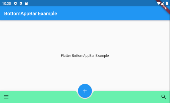
color (ex1)
BottomAppBar(
  child: Row(
    mainAxisSize: MainAxisSize.max,
    mainAxisAlignment: MainAxisAlignment.spaceBetween,
    children: <Widget>[
      IconButton(icon: Icon(Icons.menu), onPressed: () {},),
      IconButton(icon: Icon(Icons.search), onPressed: () {},),
    ],
  ),
  shape: CircularNotchedRectangle(),
  color: Colors.greenAccent
)Tutoriels de programmation Flutter
- Le Tutoriel de Flutter Column
- Le Tutoriel de Flutter Stack
- Le Tutoriel de Flutter IndexedStack
- Le Tutoriel de Flutter Spacer
- Le Tutoriel de Flutter Expanded
- Le Tutoriel de Flutter SizedBox
- Le Tutoriel de Flutter Tween
- Installer Flutter SDK sur Windows
- Installer Flutter Plugin pour Android Studio
- Créez votre première application Flutter - Hello Flutter
- Le Tutoriel de Flutter Scaffold
- Le Tutoriel de Flutter AppBar
- Le Tutoriel de Flutter BottomAppBar
- Le Tutoriel de Flutter TextButton
- Le Tutoriel de Flutter ElevatedButton
- Le Tutoriel de Flutter EdgeInsetsGeometry
- Le Tutoriel de Flutter EdgeInsets
- Le Tutoriel de CircularProgressIndicator
- Le Tutoriel de Flutter LinearProgressIndicator
- Le Tutoriel de Flutter Center
- Le Tutoriel de Flutter Align
- Le Tutoriel de Flutter Row
- Le Tutoriel de Flutter SplashScreen
- Le Tutoriel de Flutter Alignment
- Le Tutoriel de Flutter Positioned
- Le Tutoriel de Flutter SimpleDialog
- Le Tutoriel de Flutter AlertDialog
- Navigation et Routing dans Flutter
- Le Tutoriel de Flutter TabBar
- Le Tutoriel de Flutter Banner
- Le Tutoriel de Flutter BottomNavigationBar
- Le Tutoriel de Flutter FancyBottomNavigation
- Le Tutoriel de Flutter Card
- Le Tutoriel de Flutter Border
- Le Tutoriel de Flutter ContinuousRectangleBorder
- Le Tutoriel de Flutter RoundedRectangleBorder
- Le Tutoriel de Flutter CircleBorder
- Le Tutoriel de Flutter StadiumBorder
- Le Tutoriel de Flutter Container
- Le Tutoriel de Flutter RotatedBox
- Le Tutoriel de Flutter CircleAvatar
- Le Tutoriel de Flutter IconButton
- Le Tutoriel de Flutter FlatButton
- Le Tutoriel de Flutter SnackBar
Show More