Le Tutoriel de Flutter SnackBar
1. SnackBar
Dans les applications mobiles, SnackBar est un petit composant d'interface qui fournit une brève réponse après une action de l'utilisateur. Il apparaît en bas de l'écran et disparaît automatiquement lorsque le temps est écoulé ou lorsque l'utilisateur interagit ailleurs sur l'écran.
SnackBar fournit également un bouton en option pour effectuer une action. Par exemple, annuler une action que vous venez d'effectuer ou réessayer l'action que vous venez d'effectuer si elle échoue.
SnackBar Constructor:
SnackBar Constructor
const SnackBar(
    {Key key,
    @required Widget content,
    Color backgroundColor,
    double elevation,
    EdgeInsetsGeometry margin,
    EdgeInsetsGeometry padding,
    double width,
    ShapeBorder shape,
    SnackBarBehavior behavior,
    SnackBarAction action,
    Duration duration: _snackBarDisplayDuration,
    Animation<double> animation,
    VoidCallback onVisible}
)
L'application Flutter suit les directives de cohérence de Material Design pour s'assurer que lorsque SnackBar apparaît au bas de l'écran, il ne chevauche pas d'autres widgets enfants importants, tels que FloatingActionButton. Par conséquent, SnackBar doit être appelé via Scaffold.
Observer un exemple simple ci-dessous:
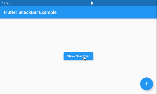
main.dart (ex1)
import 'package:flutter/material.dart';

void main() {
  runApp(MyApp());
}

class MyApp extends StatelessWidget {

  @override
  Widget build(BuildContext context) {
    return MaterialApp(
      title: 'o7planning.org',
      debugShowCheckedModeBanner: false,
      theme: ThemeData(
        primarySwatch: Colors.blue,
        visualDensity: VisualDensity.adaptivePlatformDensity,
      ),
      home: MyHomePage(),
    );
  }
}

class MyHomePage extends StatelessWidget {

  @override
  Widget build(BuildContext context) {
    return Scaffold(
      appBar: AppBar(
        title: Text('Flutter SnackBar Example'),
      ),
      floatingActionButton: FloatingActionButton(
        child: Icon(Icons.add),
        onPressed: () {},
      ),
      body: Center(
          child: Builder(
              builder: (BuildContext ctxOfScaffold)  {
                return ElevatedButton(
                    child: Text('Show SnackBar'),
                    onPressed: () {
                      this._showSnackBarMsgDeleted(ctxOfScaffold);
                    }
                );
              }
          )
      )
    );
  }

  void _showSnackBarMsgDeleted(BuildContext ctxOfScaffold) {
    // Create a SnackBar.
    final snackBar = SnackBar(
      content: Text('Message is deleted!'),
      action: SnackBarAction(
        label: 'UNDO',
        onPressed: () {
          this._showSnackBarMsgRestored(ctxOfScaffold);
        },
      ),
    );
    // Find the Scaffold in the widget tree
    // and use it to show a SnackBar.
    Scaffold.of(ctxOfScaffold).showSnackBar(snackBar);
  }

  void _showSnackBarMsgRestored(BuildContext ctxOfScaffold) {
    // Create a SnackBar.
    final snackBar = SnackBar(
      content: Text('Message is restored!')
    );
    // Find the Scaffold in the widget tree
    // and use it to show a SnackBar.
    Scaffold.of(ctxOfScaffold).showSnackBar(snackBar);
  }
}
2. content
content - Le contenu principal affiché sur le SnackBar, normalement un objet Text.
@required Widget content4. elevation
elevation - Les coordonnées de l'axe Z du SnackBar, leur valeur affecte la taille de l'ombre (shadow) du SnackBar.
double elevationRemarque: la propriété elevation ne fonctionne que pour SnackBar flottant (behavior: SnackBarBehavior.floating).
elevation (ex1)
final snackBar = SnackBar(
  content: Text('Message is deleted!'),
  elevation: 15,
  behavior: SnackBarBehavior.floating,
  action: SnackBarAction(
    label: 'UNDO',
    onPressed: ()  {
    },
  ),
)
5. margin
La propriété margin est utilisée pour créer un espace vide autour de SnackBar. Cependant, cette propriété ne fonctionne que si la valeur de behavior est SnackBarBehavior.floating et que width n'est pas spécifiée. Sa valeur par défaut est EdgeInsets.fromLTRB(15.0, 5.0, 15.0, 10.0).
EdgeInsetsGeometry margin6. padding
La propriété padding est utilisée pour créer un espace vide dans SnackBar et entourer content et action.
EdgeInsetsGeometry padding7. width
La propriété width est la largeur de SnackBar et elle ne fonctionne que si le behavior est SnackBarBehavior.floating. Si width est spécifiée, SnackBar sera placé horizontalement au centre.
double width9. behavior
La propriété behavior spécifie le comportement et la position de SnackBar.
SnackBarBehavior behavior

// Enum values:
SnackBarBehavior.fixed
SnackBarBehavior.floating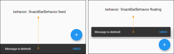
Tutoriels de programmation Flutter
- Le Tutoriel de Flutter Column
- Le Tutoriel de Flutter Stack
- Le Tutoriel de Flutter IndexedStack
- Le Tutoriel de Flutter Spacer
- Le Tutoriel de Flutter Expanded
- Le Tutoriel de Flutter SizedBox
- Le Tutoriel de Flutter Tween
- Installer Flutter SDK sur Windows
- Installer Flutter Plugin pour Android Studio
- Créez votre première application Flutter - Hello Flutter
- Le Tutoriel de Flutter Scaffold
- Le Tutoriel de Flutter AppBar
- Le Tutoriel de Flutter BottomAppBar
- Le Tutoriel de Flutter TextButton
- Le Tutoriel de Flutter ElevatedButton
- Le Tutoriel de Flutter EdgeInsetsGeometry
- Le Tutoriel de Flutter EdgeInsets
- Le Tutoriel de CircularProgressIndicator
- Le Tutoriel de Flutter LinearProgressIndicator
- Le Tutoriel de Flutter Center
- Le Tutoriel de Flutter Align
- Le Tutoriel de Flutter Row
- Le Tutoriel de Flutter SplashScreen
- Le Tutoriel de Flutter Alignment
- Le Tutoriel de Flutter Positioned
- Le Tutoriel de Flutter SimpleDialog
- Le Tutoriel de Flutter AlertDialog
- Navigation et Routing dans Flutter
- Le Tutoriel de Flutter TabBar
- Le Tutoriel de Flutter Banner
- Le Tutoriel de Flutter BottomNavigationBar
- Le Tutoriel de Flutter FancyBottomNavigation
- Le Tutoriel de Flutter Card
- Le Tutoriel de Flutter Border
- Le Tutoriel de Flutter ContinuousRectangleBorder
- Le Tutoriel de Flutter RoundedRectangleBorder
- Le Tutoriel de Flutter CircleBorder
- Le Tutoriel de Flutter StadiumBorder
- Le Tutoriel de Flutter Container
- Le Tutoriel de Flutter RotatedBox
- Le Tutoriel de Flutter CircleAvatar
- Le Tutoriel de Flutter IconButton
- Le Tutoriel de Flutter FlatButton
- Le Tutoriel de Flutter SnackBar
Show More