Le Tutoriel de Flutter Scaffold
1. Scaffold
La classe Scaffold est un widget extensible qui remplit l'espace disponible ou l'écran. Il fournit une API pour afficher les principaux widgets de l'application tels que Drawer, SnackBar, Bottom-Sheet, FloatingActionButton, AppBar et BottomNavigationBar, etc.
Scaffold Constructor:
Scaffold constructor
const Scaffold({
  Key key,
  PreferredSizeWidget appBar,
  Widget body,
  Widget floatingActionButton,
  FloatingActionButtonLocation floatingActionButtonLocation,
  FloatingActionButtonAnimator floatingActionButtonAnimator,
  List<Widget> persistentFooterButtons,
  Widget drawer,
  Widget endDrawer,
  Widget bottomNavigationBar,
  Widget bottomSheet,
  Color backgroundColor,
  bool resizeToAvoidBottomPadding,
  bool resizeToAvoidBottomInset,
  bool primary: true,
  DragStartBehavior drawerDragStartBehavior:   DragStartBehavior.down
})
2. Examples
main.dart (ex1)
import 'package:flutter/material.dart';

void main() {
  runApp(MyApp());
}

class MyApp extends StatelessWidget {
  // This widget is the root of your application.
  @override
  Widget build(BuildContext context) {
    return MaterialApp(
      title: 'o7planning.org',
      debugShowCheckedModeBanner: false,
      theme: ThemeData(
        primarySwatch: Colors.blue,
        visualDensity: VisualDensity.adaptivePlatformDensity,
      ),
      home: MyHomePage(title: 'Flutter Scaffold Example'),
    );
  }
}

class MyHomePage extends StatelessWidget {
  MyHomePage({Key key, this.title}) : super(key: key);
  final String title;

  @override
  Widget build(BuildContext context) {
    return Scaffold(
      appBar: AppBar(
        title: Text(this.title),
      ),
      body: Center(
          child:
          Text (
            'Hello World',
          )
      ),
    );
  }
}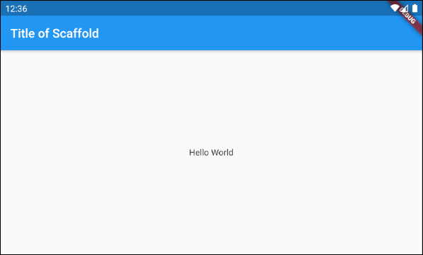
Dans l'exemple ci-dessous, on a créé un Scaffold avec deux paramètres, appBar et body.
Scaffold (appBar + body)
// Create a Scaffold with 2 parameters: appBar, body.
Scaffold(
  appBar: AppBar(
    title: Text('Flutter Scaffold Example'),
  ),
  body: Center(
      child:
      Text(
        'Hello World',
      )
  ),
);3. floatingActionButton
floatingActionButton est un bouton flottant à la surface de body. Par défaut, il flottera dans le coin inférieur droit de l'écran. Vous pouvez définir son emplacement par la propriété floatingActionButtonLocation.
Widget floatingActionButton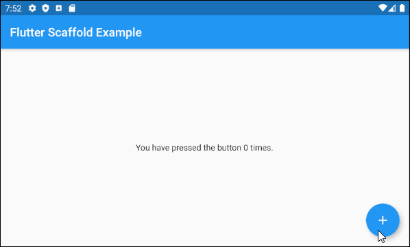
main.dart (floatingActionButton ex1)
import 'package:flutter/material.dart';

void main() => runApp(MyApp());

// This Widget is the main application widget.
class MyApp extends StatelessWidget {
  @override
  Widget build(BuildContext context) {
    return MaterialApp(
      title: "o7planning.org",
      debugShowCheckedModeBanner: false,
      theme: ThemeData(
        primarySwatch: Colors.blue,
        visualDensity: VisualDensity.adaptivePlatformDensity,
      ),
      home: MyHomePage(),
    );
  }
}

class MyHomePage extends StatefulWidget {
  MyHomePage({Key key}) : super(key: key);

  @override
  MyHomePageState createState() => MyHomePageState();
}

class MyHomePageState extends State<MyHomePage> {
  int _count = 0;

  Widget build(BuildContext context) {
    return Scaffold(
      appBar: AppBar(
        title:  Text('Flutter Scaffold Example'),
      ),
      body: Center(
          child: Text('You have pressed the button $_count times.')
      ),
      floatingActionButton: FloatingActionButton(
        onPressed: ()  {
          setState(() => this._count++);
        },
        tooltip: 'Increment Counter',
        child: const Icon(Icons.add),
      ),
    );
  }
}- Le Tutoriel de Flutter FloatingActionButton
4. floatingActionButtonLocation
La propriété FloatingActionButtonLocation est utilisée pour définir la position d'affichage de floatingActionButton. Sa valeur par défaut est FloatingActionButtonLocation.endFloat.
FloatingActionButtonLocation floatingActionButtonLocationPar exemple:
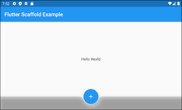
Scaffold (floatingActionButtonLocation ex1)
Scaffold(
appBar: AppBar(
title: Text('Flutter Scaffold Example'),
),
body: Center(
child: Text('Hello World')
),
bottomNavigationBar: BottomAppBar(
shape: CircularNotchedRectangle(),
color: Colors.black12,
child: Container(
height: 50.0,
),
),
floatingActionButton: FloatingActionButton(
onPressed: () {},
tooltip: 'Increment Counter',
child: Icon(Icons.add),
),
floatingActionButtonLocation: FloatingActionButtonLocation.centerDocked,
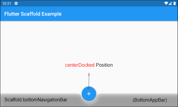
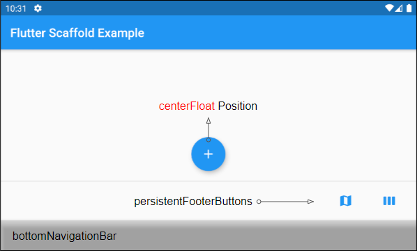
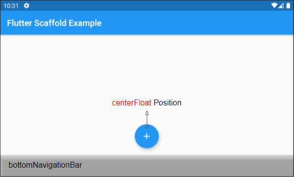
);La classe FloatingActionButtonLocation vous permet de définir la position d'affichage de FloatingActionButton. Voici plusieurs positions prédéfinies en tant que constantes statiques de cette classe:
- FloatingActionButtonLocation.centerDocked
- FloatingActionButtonLocation.centerFloat
- FloatingActionButtonLocation.centerTop
- FloatingActionButtonLocation.endDocked
- FloatingActionButtonLocation.endFloat
- FloatingActionButtonLocation.endTop
- FloatingActionButtonLocation.miniCenterDocked
- FloatingActionButtonLocation.miniCenterFloat
- FloatingActionButtonLocation.miniCenterTop
- FloatingActionButtonLocation.miniEndDocked
- FloatingActionButtonLocation.miniEndFloat
- FloatingActionButtonLocation.miniEndTo
- FloatingActionButtonLocation.miniStartDocked
- FloatingActionButtonLocation.miniStartFloat
- FloatingActionButtonLocation.miniStartTop
- FloatingActionButtonLocation.startDocked
- FloatingActionButtonLocation.startFloat
- FloatingActionButtonLocation.startTop
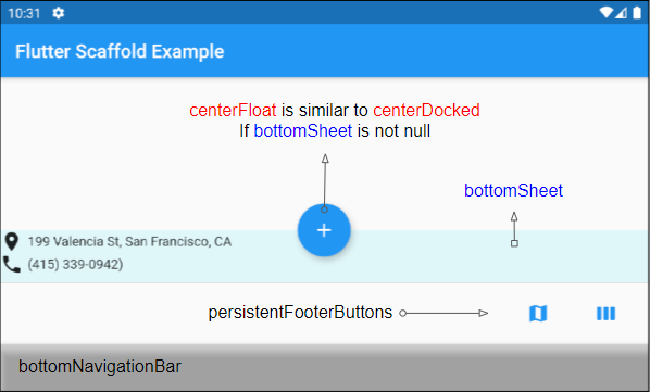
*Docked
Les constances startDocked, centerDocked, endDocked, miniStartDocked, miniCenterDocked, miniEndDocked permettent d'afficher Scaffold.floatingActionButton à la surface Scaffold.body de sorte que le centre du bouton soit aligné avec la bordure supérieure de Scaffold.bottomSheet ou Scaffold.persistenttonFooterButtons ou Scaffold.bottomNavigationBar (Dans un tel ordre de priorité).
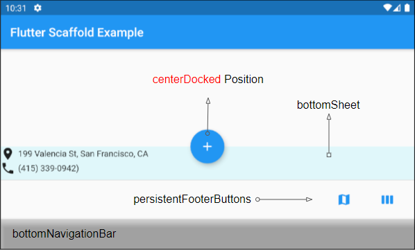
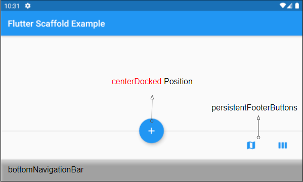
Si Scaffold.bottomSheet et Scaffold.persistentFooterButtons sont null, et Scaffold.bottomNavigationBar est un objet BottomAppBar, donc Scaffold.floatingActionButton créera une encoche (notch) à la surface de Scaffold.bottomNavigationBar.
*Float
Les constances startFloat, centerFloat, endFloat, miniStartFloat, miniCenterFloat, miniEndFloat permettent d'afficher Scaffold.floatingActionButton au-dessus sans chevaucher les deux autres widgets: Scaffold.persistentFooterButtons et Scaffold.bottomNavigationBar.
Si Scaffold.bottomSheet n'est pas null, le centre de Scaffold.floatingActionButton sera aligné avec la bordure supérieure de Scaffold.bottomSheet.
*Top
Les constances startTop, centerTop, endTop, miniStartTop, miniCenterTop, miniEndTop permettent d'afficher Scaffold.floatingActionButton en-dessous de la barre d'outils pour que le centre du bouton soit aligné avec la bordure inférieure de la barre d'outils.
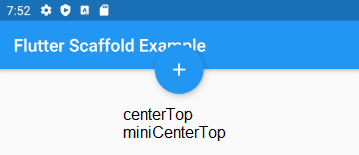
mini*
Les constantes avec le préfixe "mini" rendent le Scaffold.floatingActionButton un peu plus petit que d'habitude, ce qui équivaut au paramètre FloatingActionButton.mini = true.
5. floatingActionButtonAnimator
La propriété floatingActionButtonAnimator est utilisée pour créer des effets d'animation pour FloatingActionButton.
FloatingActionButtonAnimator floatingActionButtonAnimator6. drawer
drawer est un panneau affiché sur le côté gauche de body (si textDirection = TextDirection.ltr). En général, il est masqué sur les appareils mobiles, vous devez donc le faire glisser de gauche à droite pour le faire apparaître.
Widget drawerDans certaines situations, un bouton peut être automatiquement ajouté à AppBar.leading ou AppBar.actions pour aider l'utilisateur à ouvrir rapidement drawer, ce qui est précisément expliqué dans l'article suivant:
Par exemple:
main.dart (drawer)
import 'package:flutter/material.dart';

void main() {
  runApp(MyApp());
}

class MyApp extends StatelessWidget {
  // This widget is the root of your application.
  @override
  Widget build(BuildContext context) {
    return MaterialApp(
      title: 'Title of Application',
      theme: ThemeData(
        primarySwatch: Colors.blue,
        visualDensity: VisualDensity.adaptivePlatformDensity,
      ),
      home: MyHomePage(title: 'Flutter Scaffold Example'),
    );
  }
}

class MyHomePage extends StatelessWidget {
  MyHomePage({Key key, this.title}) : super(key: key);
  final String title;

  @override
  Widget build(BuildContext context) {
    return Scaffold (
      appBar: AppBar(
        title: Text(this.title),
      ),
      body: Center(
          child:
          Text(
            'Hello World',
          )
      ),
      drawer: Drawer(
        child: ListView(
          children: const <Widget> [
            DrawerHeader(
              decoration: BoxDecoration(
                color: Colors.green,
              ),
              child: Text(
                'Hello World',
                style: TextStyle(
                  color: Colors.green,
                  fontSize: 24,
                ),
              ),
            ),
            ListTile(
              title: Text('Gallery'),
            ),
            ListTile(
              title: Text('Slideshow'),
            ),
          ],
        ),
      ),
    );
  }
}- Le Tutoriel de Flutter Drawer
7. endDrawer
endDrawer est un panneau affiché sur le côté droit de body (si textDirection = TextDirection.ltr). En général, il est masqué sur les appareils mobiles, vous devez donc faire glisser votre doigt de droite à gauche pour le faire apparaître.
Widget endDrawerDans certaines situations, un bouton peut être automatiquement ajouté à AppBar.leading ou AppBar.actions pour aider l'utilisateur à ouvrir rapidement drawer, ce qui est explicitement expliqué dans l'article suivant:
Par exemple:
main.dart (endDrawer ex1)
import 'package:flutter/material.dart';

void main() {
  runApp(MyApp());
}

class MyApp extends StatelessWidget {
  @override
  Widget build(BuildContext context) {
    return MaterialApp(
      title: 'o7planning.org',
      debugShowCheckedModeBanner: false,
      theme: ThemeData(
        primarySwatch: Colors.blue,
        visualDensity: VisualDensity.adaptivePlatformDensity,
      ),
      home: MyHomePage(title: 'Flutter Scaffold Example'),
    );
  }
}

class MyHomePage extends StatelessWidget {
  MyHomePage({Key key, this.title}) : super(key: key);
  final String title;

  @override
  Widget build(BuildContext context) {
    return Scaffold (
      appBar: AppBar(
        title: Text(this.title),
      ),
      body: Center(
          child:
          Text(
            'Hello World',
          )
      ),
      endDrawer: Drawer(
        child: ListView(
          children: const <Widget> [
            DrawerHeader(
              decoration: BoxDecoration(
                color: Colors.green,
              ),
              child: Text(
                'Hello World',
                style: TextStyle(
                  color: Colors.green,
                  fontSize: 24,
                ),
              ),
            ),
            ListTile(
              title: Text('Gallery'),
            ),
            ListTile(
              title: Text('Slideshow'),
            ),
          ],
        ),
      ),
    );
  }
}- Le Tutoriel de Flutter Drawer
9. bottomNavigationBar
bottomNavigationBar est une barre de navigation affichée en bas de Scaffold. Dans la plupart des cas d'utilisation, il s'agit d'un objet de BottomAppBar ou de BottomNativationBar.
Widget bottomNavigationBar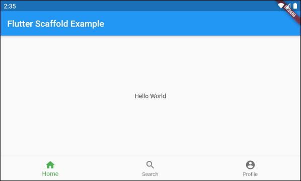
Scaffold (buttomNavigationBar)
import 'package:flutter/material.dart';

void main() {
  runApp(MyApp());
}

class MyApp extends StatelessWidget {
  // This widget is the root of your application.
  @override
  Widget build(BuildContext context) {
    return MaterialApp(
      title: 'Title of Application',
      theme: ThemeData(
        primarySwatch: Colors.blue,
        visualDensity: VisualDensity.adaptivePlatformDensity,
      ),
      home: MyHomePage(title: 'Flutter Scaffold Example'),
    );
  }
}

class MyHomePage extends StatelessWidget {
  MyHomePage({Key key, this.title}) : super(key: key);
  final String title;

  @override
  Widget build(BuildContext context) {
    return Scaffold(
      appBar: AppBar(
        title: Text(this.title),
      ),
      body: Center(
          child: Text('Hello World')
      ),
      bottomNavigationBar : BottomNavigationBar(
          currentIndex : 0,
          fixedColor  : Colors.green,
          items : [
            BottomNavigationBarItem(
              title  : Text("Home"),
              icon  : Icon(Icons.home),
            ),
            BottomNavigationBarItem(
              title : Text("Search"),
              icon  : Icon(Icons.search),
            ),
            BottomNavigationBarItem(
              title  : Text("Profile"),
              icon  : Icon(Icons.account_circle),
            ),
          ],
          onTap  : (int indexOfItem) {

          }),
    );
  }
}10. persistentFooterButtons
persistentFooterButtons est une liste de boutons encapsulés dans une ButtonBar et affichés en bas de Scaffold. Ils sont affichés en permanence même lorsque l'utilisateur fait défiler body de Scaffold. Dans la plupart des cas d'utilisation, il s'agit de TextButton(s).
List<Widget> persistentFooterButtonsPar exemple, un Scaffold avec persistentFooterButtons et sans bottomNavigationBar:
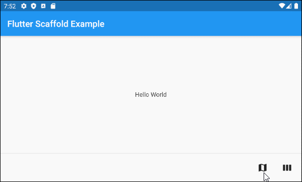
persistentFooterButtons (ex1)
Scaffold(
    appBar: AppBar(
      title:  Text('Flutter Scaffold Example'),
    ),
    body: Center(
        child: Text('Hello World')
    ),
    persistentFooterButtons :  [
      TextButton.icon(icon: Icon(Icons.map), label: Text(""), onPressed: () {}),
      TextButton.icon(icon: Icon(Icons.view_week), label: Text(""), onPressed: () {}),
    ]
)
Par exemple, un Scaffold avec persistentFooterButtons et bottomNavigationBar:
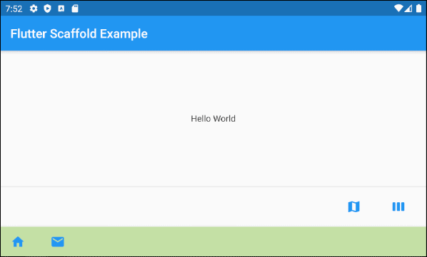
persistentFooterButtons (ex2)
Scaffold(
    appBar: AppBar(
      title:  Text('Flutter Scaffold Example'),
    ),
    body: Center(
        child: Text('Hello World')
    ),
    persistentFooterButtons :  [
      TextButton.icon(icon: Icon(Icons.map), label: Text(""), onPressed: () {}),
      TextButton.icon(icon: Icon(Icons.view_week), label: Text(""), onPressed: () {}),
    ],
    bottomNavigationBar: BottomAppBar(
      color: Colors.lightGreen[200],
      child: new Row(
        mainAxisSize: MainAxisSize.max,
        mainAxisAlignment: MainAxisAlignment.start,
        children: <Widget>[
          TextButton.icon(icon: Icon(Icons.home), label: Text(""), onPressed: () {},),
          TextButton.icon(icon: Icon(Icons.email), label: Text(""), onPressed: () {},),
        ],
      ),
    )
)11. bottomSheet
bottomSheet affiche une information supplémentaire pour le contenu principal de l'application. Il est affiché en permanence près du bas de Scaffold même lorsque l'utilisateur interagit avec d'autres parties de l'application.
Widget bottomSheetMême si bottomSheet se trouve en bas de Scaffold, il se tient toujours devant persistentFooterButtons et bottomNavigationBar.
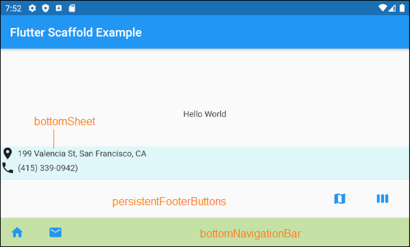
bottomSheet (ex1)
Scaffold(
    appBar: AppBar(
      title:  Text('Flutter Scaffold Example'),
    ),
    body: Center(
        child: Text('Hello World')
    ),
    bottomSheet: Container(
        height: 55,
        color: Colors.cyan[50],
        child:Column    (
          children: [
            Row (
              children: [
                Icon(Icons.place),
                SizedBox(width:5, height:5),
                Text("199 Valencia St, San Francisco, CA")
              ],
            ),
            Row (
              children: [
                Icon(Icons.phone),
                SizedBox(width:5, height:5),
                Text("(415) 339-0942)")
              ],
            )
          ],
        )
    ),
    persistentFooterButtons :  [
      TextButton.icon(icon: Icon(Icons.map), label: Text(""), onPressed: () {}),
      TextButton.icon(icon: Icon(Icons.view_week), label: Text(""), onPressed: () {}),
    ],
    bottomNavigationBar: BottomAppBar(
      color: Colors.lightGreen[200],
      child: new Row(
        mainAxisSize: MainAxisSize.max,
        mainAxisAlignment: MainAxisAlignment.start,
        children: <Widget>[
          TextButton.icon(icon: Icon(Icons.home), label: Text(""), onPressed: () {},),
          TextButton.icon(icon: Icon(Icons.email), label: Text(""), onPressed: () {},),
        ],
      ),
    )
)
ScaffoldState.showButtonSheet()
La méthode ScaffoldState.showBottomSheet() est utilisée pour créer et afficher bottomSheet pour Scaffold si nécessaire, et l'utilisateur peut fermer bottomSheet pour économiser de l'espace pour l'application.
main.dart (bottomSheet ex2)
import 'package:flutter/material.dart';
void main() => runApp(MyApp());
// This Widget is the main application widget.
class MyApp extends StatelessWidget {
@override
Widget build(BuildContext context) {
return MaterialApp(
title: "o7planning.org",
debugShowCheckedModeBanner: false,
theme: ThemeData(
primarySwatch: Colors.blue,
visualDensity: VisualDensity.adaptivePlatformDensity,
),
home: MyHomePage(),
);
}
}
class MyHomePage extends StatefulWidget {
MyHomePage({Key key}) : super(key: key);
@override
MyHomePageState createState() => MyHomePageState();
}
class MyHomePageState extends State<MyHomePage> {
Widget build(BuildContext context) {
return Scaffold(
appBar: AppBar(
title: Text('Flutter Scaffold Example'),
),
body: Center(
child: Center(
child: Builder ( // The Builder return a ElevatedButton
// We need a context of Scaffold
builder: (BuildContext ctxOfScaffold) {
return ElevatedButton(
onPressed: () {
this._showMyBottomSheet(ctxOfScaffold);
},
child: Icon(Icons.add),
);
},
)
),
),
floatingActionButton: Builder ( // The Builder return a FloatingActionButton
// We need a context of Scaffold
builder: (BuildContext ctxOfScaffold) {
return FloatingActionButton(
onPressed: () {
this._showMyBottomSheet(ctxOfScaffold);
},
tooltip: 'Increment Counter',
child: Icon(Icons.add),
);
},
),
bottomNavigationBar: BottomAppBar(
color: Colors.lightGreen[200],
child: new Row(
mainAxisSize: MainAxisSize.max,
mainAxisAlignment: MainAxisAlignment.start,
children: <Widget>[
TextButton.icon(icon: Icon(Icons.home), label: Text(""), onPressed: () {},),
TextButton.icon(icon: Icon(Icons.email), label: Text(""), onPressed: () {},),
],
),
)
);
}
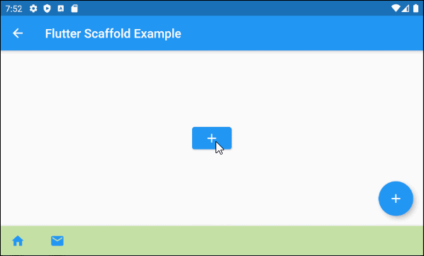
// We need a context object of Scaffold to draw Scaffold.bottomSheet.
void _showMyBottomSheet(BuildContext ctxOfScaffold) { // context of Scaffold.
// ScaffoldState.showBottomSheet:
Scaffold.of(ctxOfScaffold).showBottomSheet<void>(
(BuildContext context) {
return Container(
height: 200,
color: Colors.amber,
child: Center(
child: Column(
mainAxisAlignment: MainAxisAlignment.center,
mainAxisSize: MainAxisSize.min,
children: <Widget>[
const Text('BottomSheet'),
ElevatedButton(
child: Text('Close BottomSheet'),
onPressed: () => Navigator.pop(context),
)
],
),
),
);
},
);
}
}showModalBottomSheet()
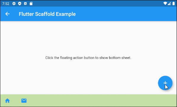
La fonction showModalBottomSheet() est utilisée pour créer et afficher un Dialog (boîte de dialogue) contenant une bottom-sheet, qui flotte au-dessus de tous les autres éléments de l'application. L'utilisateur doit le fermer s'il souhaite interagir avec les éléments en dessous.
main.dart (bottomSheet ex3)
import 'package:flutter/material.dart';

void main() => runApp(MyApp());

class MyApp extends StatelessWidget {
  @override
  Widget build(BuildContext context) {
    return MaterialApp(
      title: 'o7planning.org',
      debugShowCheckedModeBanner: false,
      theme: ThemeData(
        primarySwatch: Colors.blue,
      ),
      home: MyHomePage(title: 'Flutter Scaffold Example'),
    );
  }
}

class MyHomePage extends StatefulWidget {
  MyHomePage({Key key, this.title}) : super(key: key);

  final String title;

  @override
  MyHomePageState createState() => MyHomePageState();
}

class MyHomePageState extends State<MyHomePage> {

  @override
  Widget build(BuildContext context) {
    return Scaffold(
        appBar: AppBar(
          title: Text(widget.title),
        ),
        body: Center(
          child: Column(
            mainAxisAlignment: MainAxisAlignment.center,
            children: <Widget>[
              Text(
                'Click the floating action button to show bottom sheet.',
              ),
            ],
          ),
        ),
        floatingActionButton: FloatingActionButton(
          onPressed:() =>  _showMyBottomSheet(context),
          child: Icon(Icons.add),
        ),
        bottomNavigationBar: BottomAppBar(
          color: Colors.lightGreen[200],
          child: new Row(
            mainAxisSize: MainAxisSize.max,
            mainAxisAlignment: MainAxisAlignment.start,
            children: <Widget>[
              TextButton.icon(icon: Icon(Icons.home), label: Text(""), onPressed: () {},),
              TextButton.icon(icon: Icon(Icons.email), label: Text(""), onPressed: () {},),
            ],
          ),
        )
    );
  }


  void _showMyBottomSheet(BuildContext context) {
    // Call showModalBottomSheet(), this function open a Dialog
    // and return Future object.
    showModalBottomSheet (
        context: context,
        builder: (ctx) {
          return Container(
            height: MediaQuery.of(context).size.height  * 0.4,
            child: Center(
              child: Text("Welcome to o7planning.org!"),
            ),
          );
        }
    );
  }
}12. backgroundColor
La propriété backgroundColor est utilisée pour définir la couleur d'arrière-plan de Scaffold.
Color backgroundColorPar exemple:
backgroundColor (ex1)
Scaffold(
  appBar: AppBar(
    title:  Text('Flutter Scaffold Example'),
  ),
  body: Center(
      child: Text('Hello World')
  ),
  backgroundColor: Colors.greenAccent,
)Tutoriels de programmation Flutter
- Le Tutoriel de Flutter Column
- Le Tutoriel de Flutter Stack
- Le Tutoriel de Flutter IndexedStack
- Le Tutoriel de Flutter Spacer
- Le Tutoriel de Flutter Expanded
- Le Tutoriel de Flutter SizedBox
- Le Tutoriel de Flutter Tween
- Installer Flutter SDK sur Windows
- Installer Flutter Plugin pour Android Studio
- Créez votre première application Flutter - Hello Flutter
- Le Tutoriel de Flutter Scaffold
- Le Tutoriel de Flutter AppBar
- Le Tutoriel de Flutter BottomAppBar
- Le Tutoriel de Flutter TextButton
- Le Tutoriel de Flutter ElevatedButton
- Le Tutoriel de Flutter EdgeInsetsGeometry
- Le Tutoriel de Flutter EdgeInsets
- Le Tutoriel de CircularProgressIndicator
- Le Tutoriel de Flutter LinearProgressIndicator
- Le Tutoriel de Flutter Center
- Le Tutoriel de Flutter Align
- Le Tutoriel de Flutter Row
- Le Tutoriel de Flutter SplashScreen
- Le Tutoriel de Flutter Alignment
- Le Tutoriel de Flutter Positioned
- Le Tutoriel de Flutter SimpleDialog
- Le Tutoriel de Flutter AlertDialog
- Navigation et Routing dans Flutter
- Le Tutoriel de Flutter TabBar
- Le Tutoriel de Flutter Banner
- Le Tutoriel de Flutter BottomNavigationBar
- Le Tutoriel de Flutter FancyBottomNavigation
- Le Tutoriel de Flutter Card
- Le Tutoriel de Flutter Border
- Le Tutoriel de Flutter ContinuousRectangleBorder
- Le Tutoriel de Flutter RoundedRectangleBorder
- Le Tutoriel de Flutter CircleBorder
- Le Tutoriel de Flutter StadiumBorder
- Le Tutoriel de Flutter Container
- Le Tutoriel de Flutter RotatedBox
- Le Tutoriel de Flutter CircleAvatar
- Le Tutoriel de Flutter IconButton
- Le Tutoriel de Flutter FlatButton
- Le Tutoriel de Flutter SnackBar
Show More